
2017 was a big year for the shop. We delivered data visualization projects for clients working in: Museums, Cities and Infrastructure, Land conservation in the American West, Global Health, Satellite imagery and neural networks, built some Data visualization platforms and Giant 3d murals, and ran and participated in multiple Data visualization classes & workshops. And this was the year we won the National Design Award from the Smithsonian.
As always, the variety of the projects we do is the thing I take the most pride in here at Stamen.
To the work!
Museums
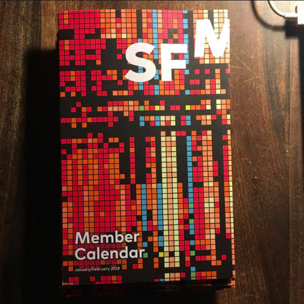
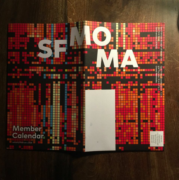
SFMOMA Designed in California
We had some work we did with UC Berkeley’s Banfield Lab featured on the cover of January 2018’s SFMOMA member calendar. The calendar is publicizing (among other things) SFMOMA’s upcoming “Designed in California,” with work from, among others, Charles & Ray Eames, Stewart Brand, and us!

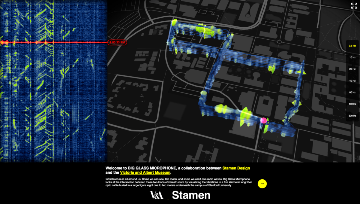
Visualizing the unseen life of a fiber optic cable buried under the Stanford campus
The Victoria and Albert Museum commissioned us to develop Big Glass Mic for inclusion in their “The Future Starts Here” exhibition. The project is an interactive visualization of the vibrations in a five kilometer long fiber optic cable buried underneath the campus of Stanford University. The cable is mostly used for analyzing seismic waves as they pass through campus; we’re using it to look closer at activities closer to home.
We were thrilled to see the project in Smithsonian Magazine, as well as Fast Company, CityLab, Vice, & the San Jose Mercury News.
Cities and infrastructure
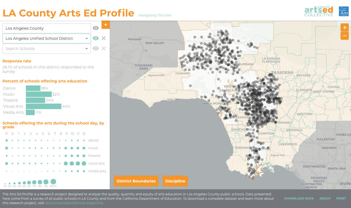
LACAC Arts Partners Report 2017
The LA County Arts Education Profile survey was administered to all 2,277 public schools in LA County to learn about the quantity, quality and equity of arts education. The study found that nearly every school offers at least some arts instruction, and most schools offer at least two disciplines. At the same time, it found troubling inequities that reflect disparities in the wider society. These disparities, and other aspects of the staggering number of public schools in LA, are available for browsing & analyzing in this report & interactive map. And it wouldn’t be a proper public communications project if it didn’t make the data available for download, here.
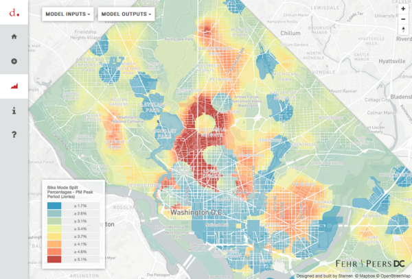
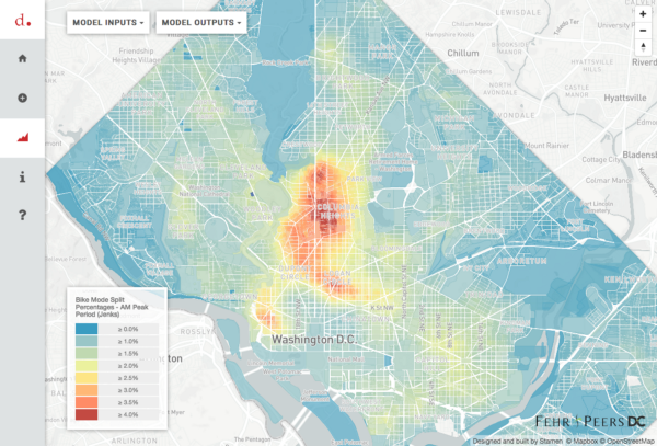
Visualizing transportation in Washington DC
Transportation consultants Fehr & Peers asked us to help them better visualize the impact of mixed use development on transit in DC. Most transportation models tend to assume that a development is either retail, or work space, or housing, and so they don’t really account for the different kinds of traffic that result when a mixed use development goes into a neighborhood. Traditional trip planning models tend to fail to take into account other modes of transportation aside from cars. As a result they underestimate the volume of trips a particular project will generate. This tool aims to fix that.
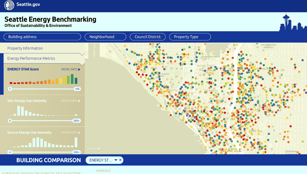
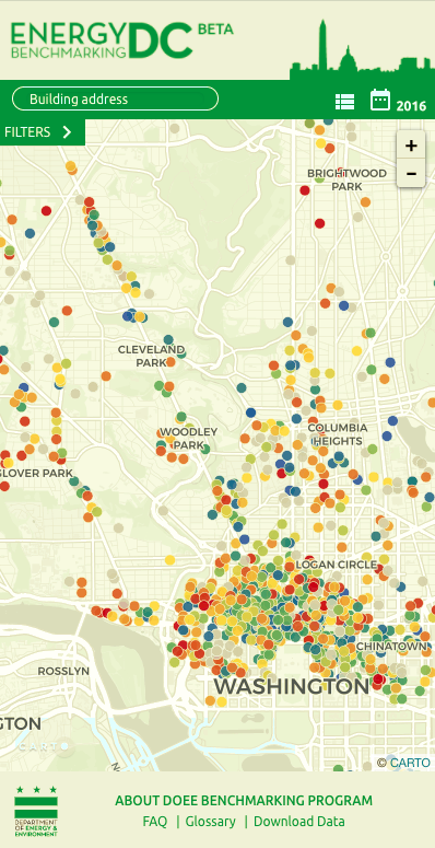
Energy Benchmarking Platform
We’ve kept pretty quiet about this part of things for now, but this year you’ll hear more about a platform we’re helping develop that lets cities across the US tell better stories about their energy usage. Cities are beginning to agree on common standards for how to both meet their carbon targets and communicate about them in ways that make sense to others, and we’re looking forward to helping roll out this work at scale. The project is live at http://www.seattle.gov/energybenchmarkingmap/#seattle/ and http://energybenchmarkingdc.org/#dc/.
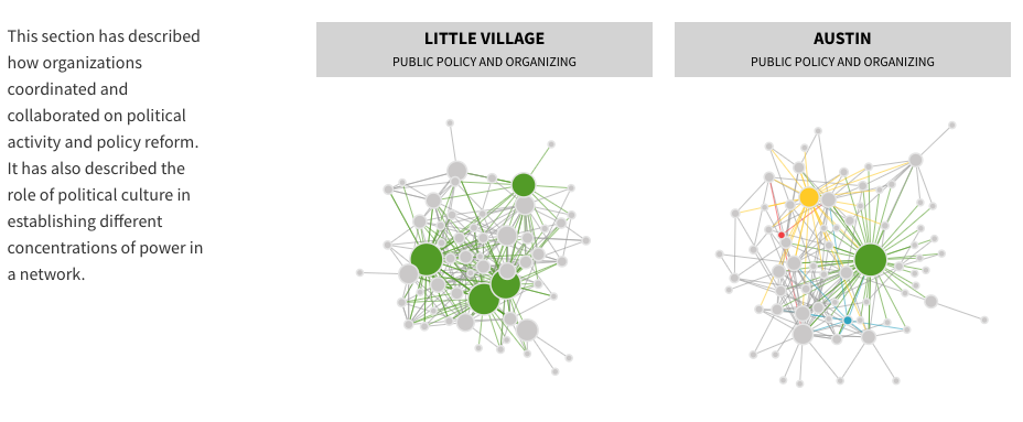
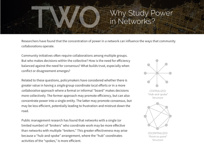
Visualizing the power of urban community networks for MDRC
MDRC, a nonprofit that builds knowledge to improve social policy, asked us to help them visualize their findings from a new report, “Power In Community Networks.” Their teams worked on the ground with community groups in Chicago — local networks of churches, community organizations, charitable groups, neighborhood watches, and the like — and analyzed how those groups were connected with one another. Some neighborhoods are organized on a hub and spoke model, others are more loosely distributed. Each has their own characteristic structure, and power is configured differently in different places. The report, and these visualizations, provide objects to think with and talk out loud about the way that power networks exist across Chicago neighborhoods.
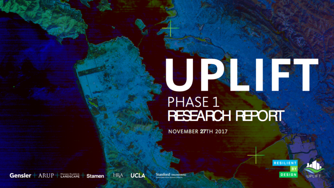
Resilient by Design 2017
As part of a team that includes Gensler, Arup, UCLA, Margie Ruddick, H&RA and Stanford University, Stamen was chosen to be part of the Resilient By Design Challenge. This year-long collaborative design challenge brings together teams of architects, urbanists, hydrologists, universities and other groups to address the future of the San Francisco Bay and how we can meet that future together in ways that are equitable, safe and sustainable. Our team, Team Uplift, conducted extensive research throughout the Bay Area to identify sites for intervention and investment that will help the Bay Area better manage future and current sea level rise, severe storms, flooding and earthquakes. We presented our ideas to the group on November 27th, and the next presentation is happening on January 27 at the California College of the Arts.
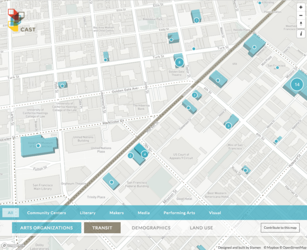
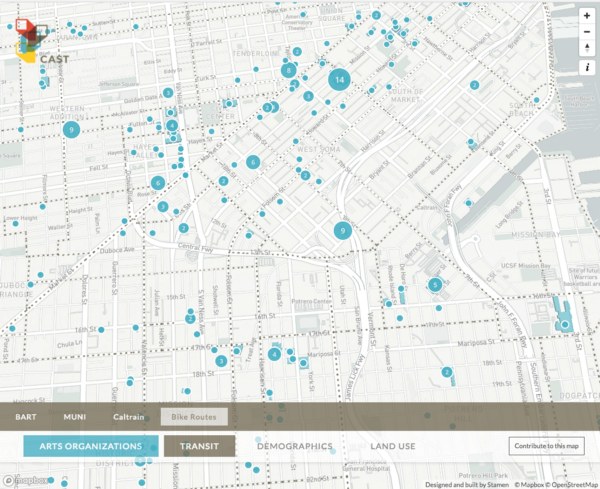
Mapping the landscape of art and real estate in San Francisco
This one’s almost but not quite ready to launch, but I’m super excited about it, so am including it here anyhow. It’s an interactive map of the nonprofit arts sector in San Francisco as it relates to transit, demographics, and land use, something I’ve had a close eye on for some time now.
The tool is intended to enable conversation about the relationship between proposed arts-related real estate projects and different aspects of city life. One example isto help real estate developers, funders & philanthropists identify new opportunities for investment in arts and cultural activities. Want to know how close community centers are to the planned Caltrain routes? Check. What the private development pipeline is for the four blocks around your new real estate acquisition? Done. We’ll announce on twitter when it’s live, which should be soon.
Land conservation in the American West
Maps of the Columbia River
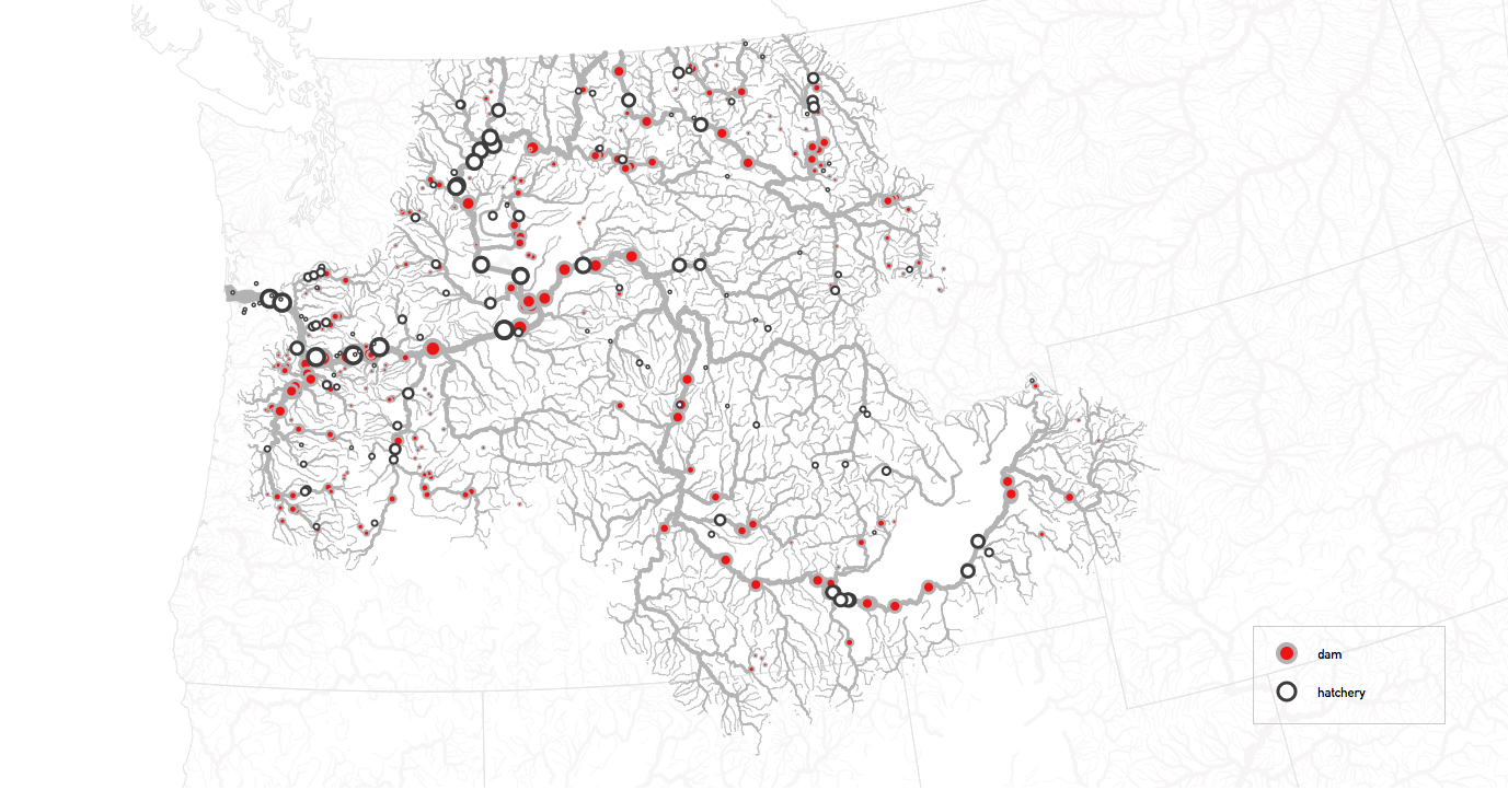
One of the best parts of my job is getting the opportunity to have entirely new landscapes brought to my door. River Guide Jim Norton came to us with a story about the Columbia River that has completely changed my view of the Pacific Northwest and this incredible river system that has been so thoroughly altered by human intervention. The sheer amount of time and money and infrastructure that goes into keeping a system of fisheries and hatcheries flowing in a river that’s too hot for salmon to live in boggles the mind. Jim has helped us understand the complexities of what he calls “The Matrix on the Columbia,” a bizarre and fascinating set of interlocking assumptions about what the river is “for” that have led to some spectacularly inefficient and wasteful behaviors. As dams start coming down across the West, the Columbia will continue to be a vital part of our conversation about landscape and natural systems, and we look forward to telling this story publicly.
MPG RANCH
We’re an enthusiastic partner to MPG Ranch, helping their scientists communicate to the public about the restoration work they’re doing on a 10,000 acre ranch in western Montana.This year we added to the growing canon of MPG Ranch a unique opportunity to experience the live happenings on the property — from motion-activated photography and livestreams of various locations to realtime weather updates. This map allows an extensive map-based view into the daily lives of the animals, plants, and other species that call Montana home.
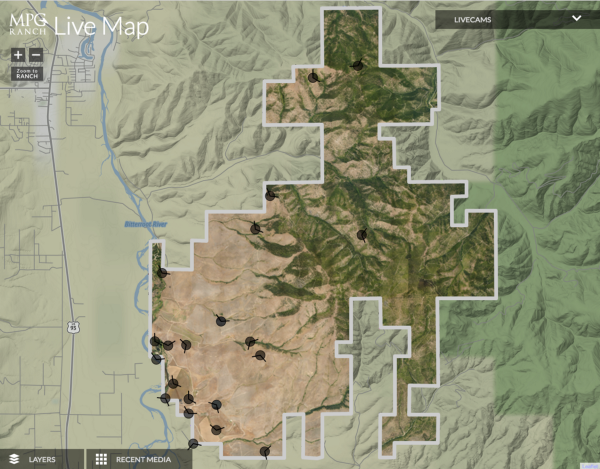
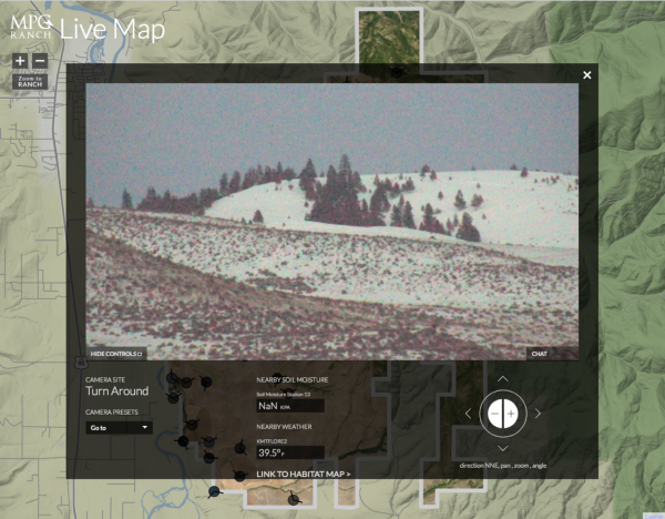
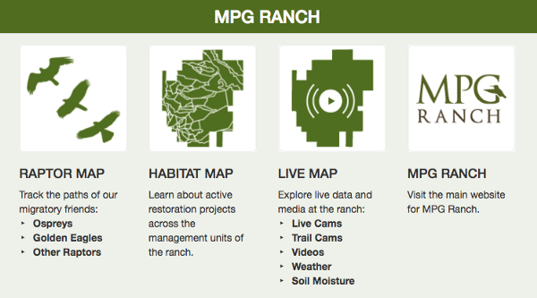
In addition to the livemap, we also built a centralized hub for investigating the variety of content about the ranch, including the three maps that we have developed with the scientists. This portal serves as both a jumping off point for exploration, and an anchor for the layers of interlinking that we’ve recently added between the maps, so that everything hangs together.
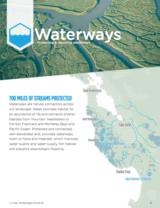
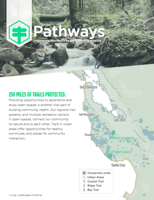
Visualizing open space for the Peninsula Open Space Trust
POST is one of the main forces behind keeping this part of the world so eye-poppingly beautiful and vibrant. They asked us to help them communicate their work in the Living Landscapes Initiative, which protects waterways, pathways, working lands and wildlife on the San Francisco Peninsula.
Global Health
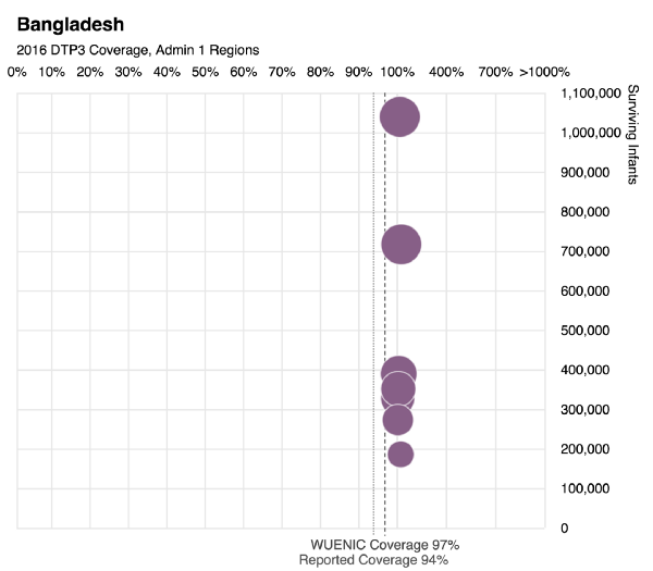
Global immunization coverage for the World Health Organization
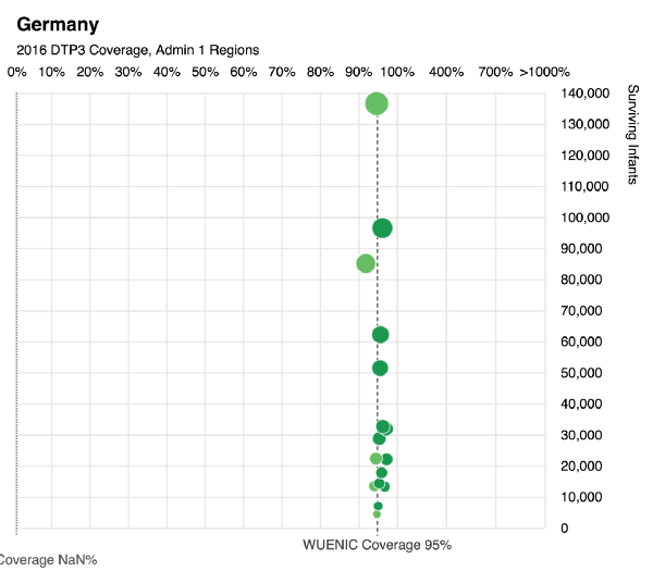
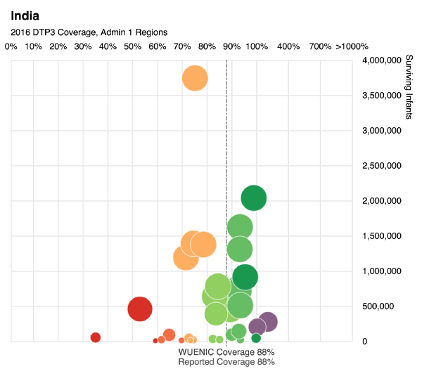
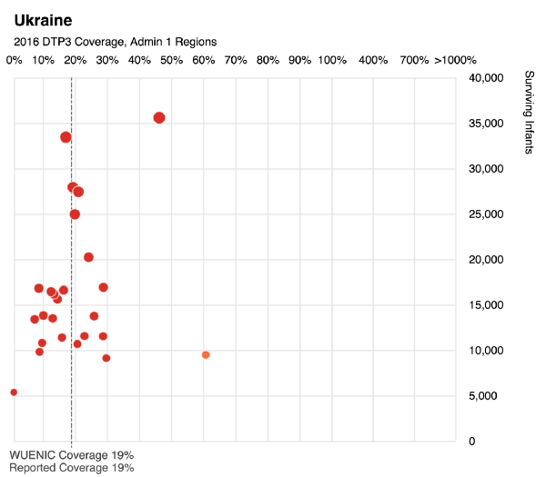
WHO asked us to continue our work visualizing global child immunization coverage, this time breaking individual countries onto their own DTP3(diptheria-tetanus-pertussis) graphs. It’s the first time subnational data has been collected at the global level, so there are some limitations to the data, but it’s the best that exists so far. Each dot is a municipality. For each municipality in the country, we display the # of children who’ve been immunized on the x axis and the number of them that survive in the y-axis.
The color shows which bucket each municipality is in, for easy reading. Purple dots indicate municipalities for which the number of immunized children is greater than the number of children that actually live there. We originally thought this was an error in the data, but it turns out that this is an indication of a urban area surrounded by other municipalities that don’t have any immunization facilities, so parents bring their children from the country to the city to get them treated. In other words, lots of purple is a pretty good proxy for a country with lots of poor areas with substandard medical facilities
What fascinates me about these views is that you start to be able to “read” which country is which based on the graphics display. It makes sense that Bangladesh would have very large municipalities, all of which are in a sense importing patients from the countryside. Germany is almost all green. India is all over the place, with a wide distribution of sizes and immunization rates. And Ukraine, sadly, leaps off the screen as a place where children are very much still at risk.
The report is online here.
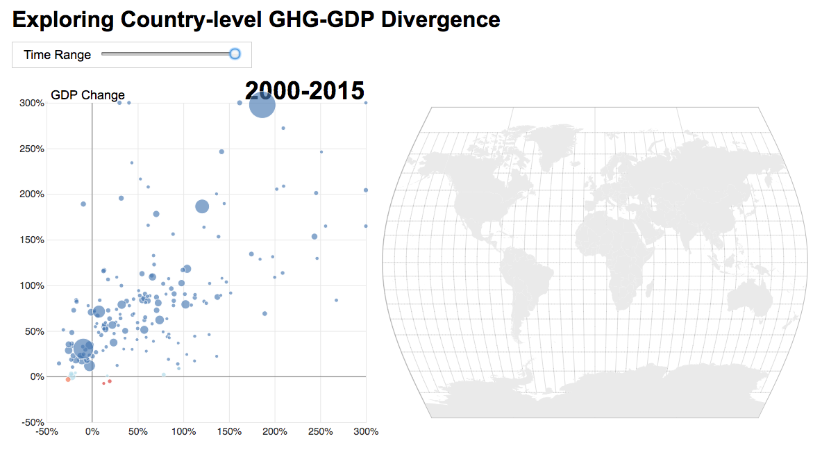
Mapping the relationship between carbon emissions and gross domestic process for the World Resources Institute
This work involved providing tools for the organization to have conversations about carbon emissions & economic growth. There’s a widespread assumption that in order for a country’s bottom line to its carbon emissions have to go up as well. While those have often been linked in the past, the graph below shows that while some countries’ strong economic growth and carbon emissions are strongly correlated (above right: China), there is significant room for economic growth can be accompanied by a reduction in greenhouse gases (lower left: USA, UK, Netherlands, Ireland). In the final version (not public yet), you can browse the final piece, including data about the number of people using the Internet, access to electricity, and other metrics.
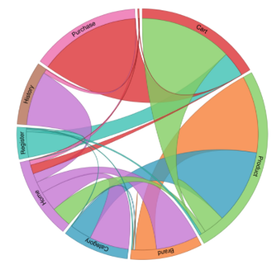
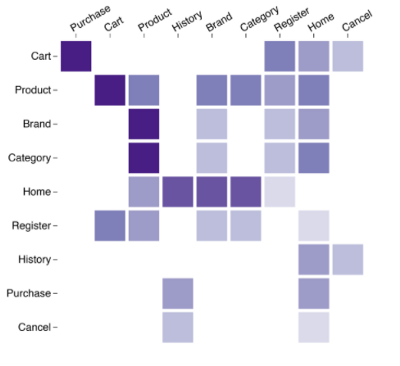
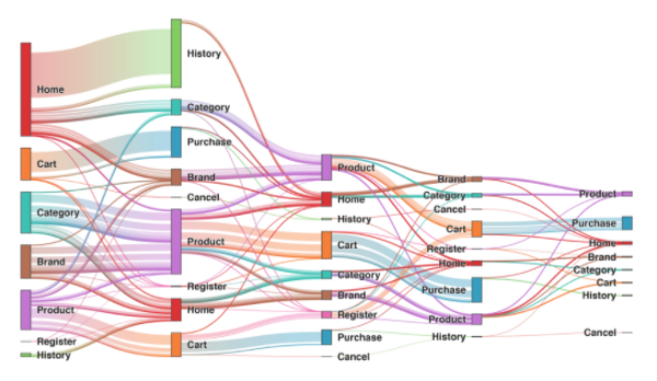
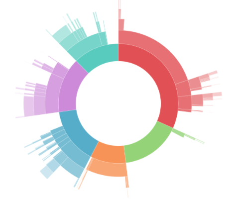
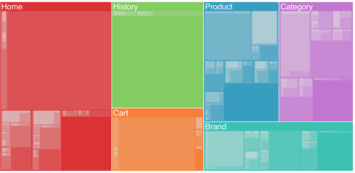
Data visualization design for Looker
We’re often brought in to help companies take their products to the next level of visual and interactive polish; we’ve done maps for Pinterest and CartoDB, helped the Banfield Lab up their game when it comes to visualizing metagenomics, and so on. This year was our turn to work with Looker, a data analytics platform, on a set of open source interactive frameworks allowing Looker users (and the public) to easily visualize their looker data as treemaps, sunbursts, sankey diagrams, matrices, and chords. Each visualization type is packaged as an open source library, and you can find out more about them on Looker’s GitHub page.
Satellite imagery and neural networks
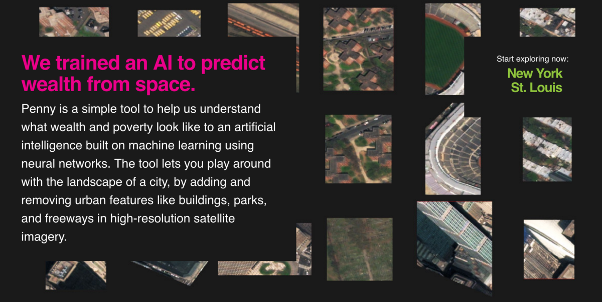
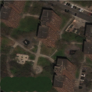
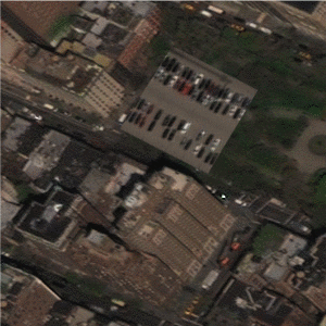
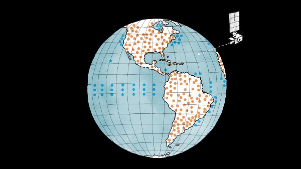
Playful artificial intelligence projects with Digital Globe
We had a terrific time working with Jordan Winkler at Digital Globe and Aman Tiwari at Carnegie Mellon on the intersection of satellite imagery, machine learning and artificial intelligence, and exploratory storytelling. The first project in this partnership, Penny, trained an AI to predict wealth from space. The second project in the partnership, which doesn’t have an official name yet but which I’ve been describing as Penny’s teenage child who just learned how to drive and is beautiful and terrifying, involves training a set of dueling AIs to generate artificial satellite imagery based on demographic information. Look for more in this vein from us this year.
Penny was featured in Wired, Fast Company, Hyperallergic, CityLab, and Vice. I talked about the teenager at TEDx Bari.
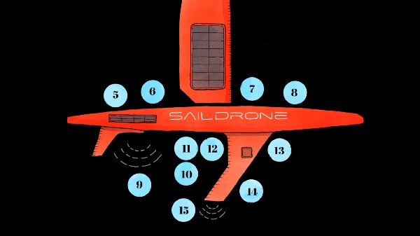
Illustrations for Saildrone
We worked with our studio mate the amazing Catalina Ple to help Saildrone get ready for a TEDx presentation about what they do. Saildrone is developing a fleet of autonomous robot sailboats to help better understand the ocean, which we know so. much. less. about. than I had thought before I heard Sebastien & Richard talk about it. Saildrone’s audacious vision is to have a fleet of hundreds of their self-powered, autonomous robots in the ocean at all times, providing a real time view that is provided by quiet, unobtrusive boats.
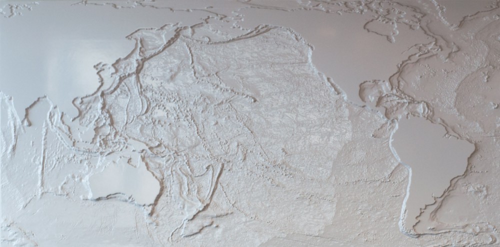
3d map mural for Matson
Matson commissioned us to create an anchoring art piece for the boardroom at their recently redesigned offices in Oakland, CA. It was super fun to get involved in all the details of making a cohesive looking 6′ long milled out 3d mural; technical details are here.
Data visualization classes & workshops
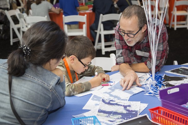
Spatial Data Lab Workshop at Stanford University
The Stanford Data Lab invited us to lead a workshop at their offices covering data communication strategies. SDL is starting a new a project with the Stanford Center on Poverty and Inequality, and are working with
California county welfare directors to create a map that will help their agencies target poor families who qualify but don’t make use of a large anti-poverty program. We worked with a tack-sharp group of students and with Bill Behrman from the SDL to help get the Data Lab the answers they were looking for. Here’s what Bill said about the workshop:
I had no idea how much mapping technology had advanced. It was amazing to me to watch Alan and the lead student on the poverty project complete the map so quickly. At lunch he also provided the students with fine career advice.
We love doing this kind of thing; if we can help you up your mapping or dataviz game please get in touch.
Workshops, workshops, workshops
We continued to use our Mission District headquarters as a forum for all kinds of interesting conversations and classes, from using machine learning to build and design the next generation of maps to more introductory workshops, taught by Alan and with the new addition of Curran Kelleher.
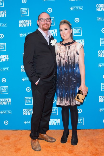
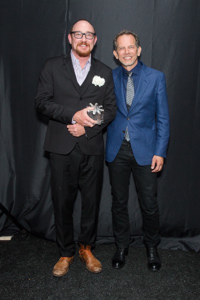
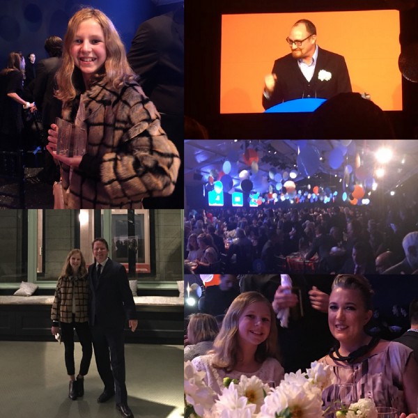
2017 National Design Award
This is the year that Stamen won the National Design Award from the Cooper Hewitt Smithsonian Museum of Design. It was terrific to have Michael Gough on the stage, my old boss from Quokka who gave me the idea that data visualization could be entertaining, twenty years ago. Sean taught a class to local kids, Jim brought his daughter to show her what a proper New York design gala looks like, and I got to thank my wife on stage and say “screw you, Raimund Abraham” to a packed house of New York’s design community. It was great to come home.

And, fond farewells
You stay in business long enough, you wind up having to say good bye to some good old friends. This year it was Sean Connelly’s turn; he and I had a great seven year run working on everything from tools to visualize data in CityTracking, maps of the Netherlands for VPRO, a hurricane tracker for the Weather Channel, tons of work with the California Healthcare foundation mapping health in Calfornia, visualizing twitter with MTV and maps.stamen.com to the latest artificial intelligence work with Penny. He’s been involved in so many projects here that it’s hard for me to imagine Stamen without him, and I’m going to miss him. Cheers and good luck Sean!
That’s it! Thanks to all our amazing clients for allowing us to help you communicate strategically about your data and aims. Happy New Year!