
When it comes to making maps online there are many tools available, but they all have one thing in common: Geographic coordinates go in and a two-dimensional image comes out. Converting from geographic coordinates (longitude,latitude) to pixel coordinates is accomplished via a map projection. Most of the tools made for online map making focus on facilitating the navigation of a map with layers of geospatial data. Leaflet and Mapbox GL are two such tools and they do their job well. There is one tool that focuses on the projections and lets you decide how to present the geospatial data: d3.js projections.
What happens when you bring geospatial data into the rich and expressive d3.js data visualization ecosystem? The possibilities are endless, and this post attempts to explore and categorize some of them.
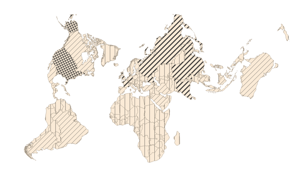
custom style
One of the first things that stands out is the potential for custom styling. Once you have used a projection to create SVG elements you can style them to your hearts content. The following example utilizes some of SVG’s features like <defs> and <use>, and the textures.js library to render custom patterns on a map.
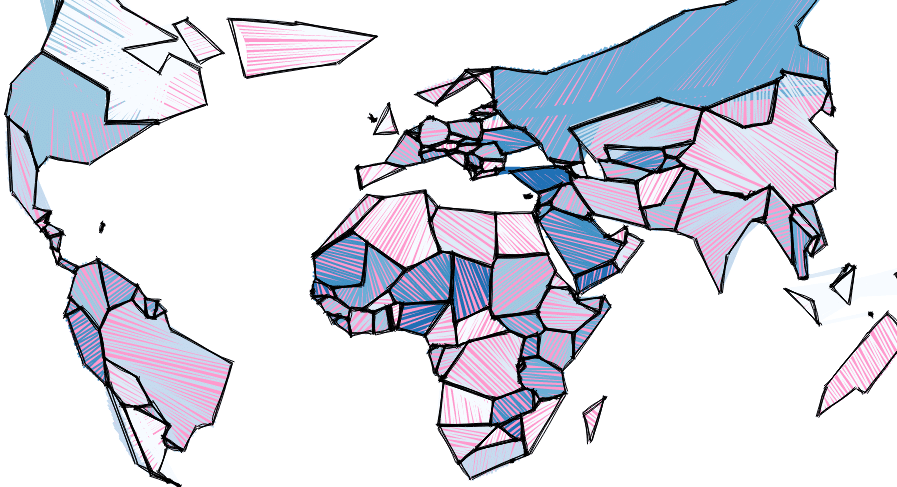
It’s not just SVG either, here is an example of generating a sketchy style using an algorithm that renders to canvas.
The key idea here is that we get to use all of the tools we are familiar with in HTML5, SVG and CSS to express our geospatial data. We have complete control over the rendering, which leads to some powerful possibilities.
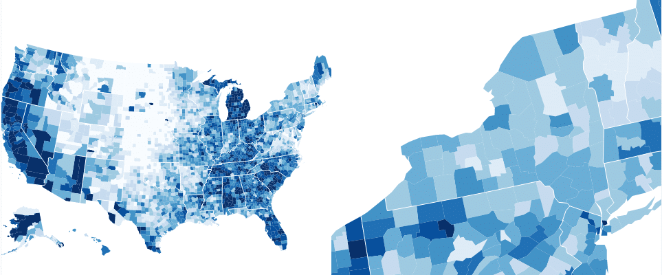
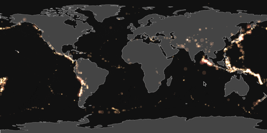
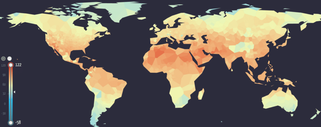
custom data
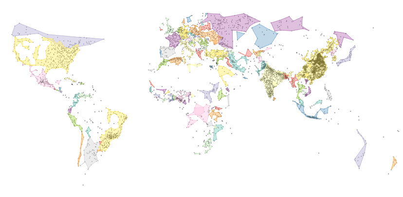
The most common use of d3.js projections is customizing the representation of data that has a geospatial component. The following examples show a small sample of the variety of ways that people have visualized data in a geographic context.
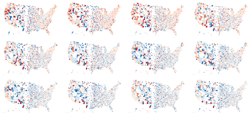
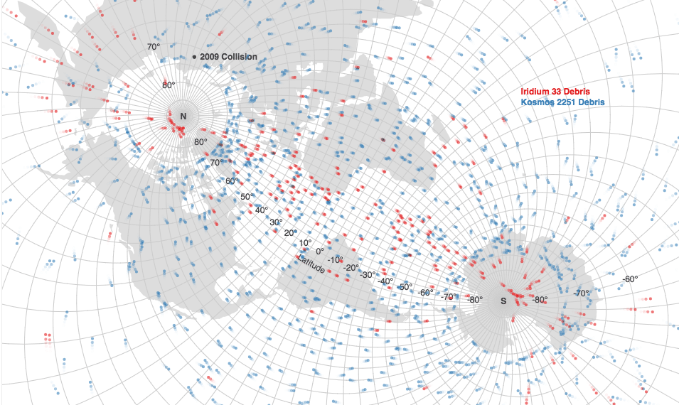
From these examples we can see that the size, shape and even number of maps can all be changed to suit the visualizations purpose. The wide variety can be seen in this search of d3 examples.
custom transitions
A powerful concept in d3 is transitions. Animating a visualization between two states when the underlying data changes is a great way to provide consistency to the viewer. This is no different when using geospatial data as d3 can animate a transition between two projections. You can also transition the parameters of the projection, such as the center, scale and rotation.
Projection transitions are used here to help understand the differences between projections.
This example transitions between two different representations of the data, a standard choropleth map and a dorling cartogram.
This example allows the user to choose between a globe projection and the traditional Mercator projection.

Transitions can also be abused to induce sea sickness.
As they say, “change is the only constant” so being able to incorporate change into your visualization opens the door to many interesting posibilities.
custom interaction
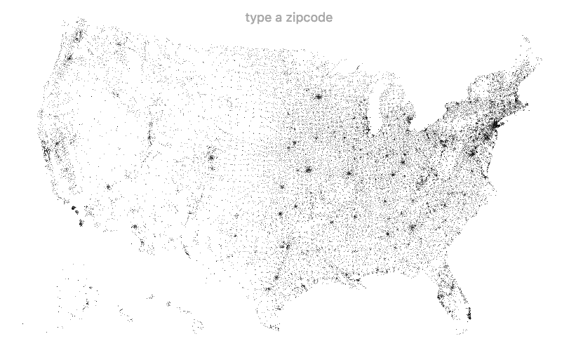
One of the more exciting aspects of web based visualization is the ability to include interaction. Because projections allow you to create DOM elements, you can leverage the existing browser APIs (made easier with d3’s selections and event handlers) to provide custom interactions with your geospatial data. These examples show some simple but powerful interactions with the mouse cursor.
In the following example a zoomed-in version of the map is rendered on the right hand side, centered on wherever the cursor is pointing in the left map.
example by Kai Chang
This example uses fish-eye distortion around the cursor to allow the user to inspect densely plotted points inside the same map.
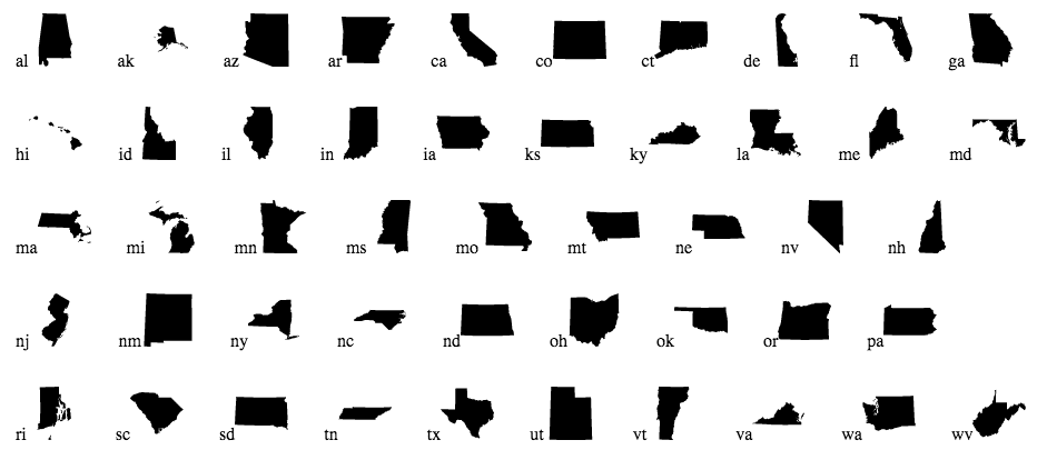
custom geometry
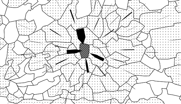
It may be desirable to create geometry from data in order to approximate it, or group it together visually. With d3 projections you can run any algorithm that works on two dimensional coordinates. A fairly common algorithm is the voronoi diagram seen in these two examples.
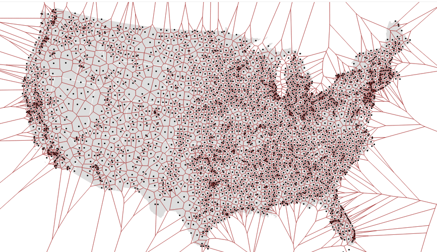
A lesser known but useful technique is to generate a concave hull to group data together.
The key takeaway is that d3 projections bring you into the well-studied realm of 2D graphics, your tool set can be expanded from mapping-specific to anything that has been invented for manipulating x,y coordinates.
custom composition
It is not just the rendering of the geographic shapes that can be customized, but what you do with them once they are rendered as well. Many geographic features are instantly recognizable (at least to relevant audiences) and can be used as icons. d3’s projections make it convenient to render single features independently, for arrangements outside of a traditional map.
Layering two locations in the same projection make for an educational example.
Once your geospatial data becomes a set of DOM elements, you can lay it out with the same flexibility and specifity as any other HTML and CSS project.
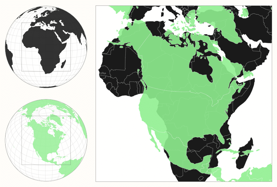
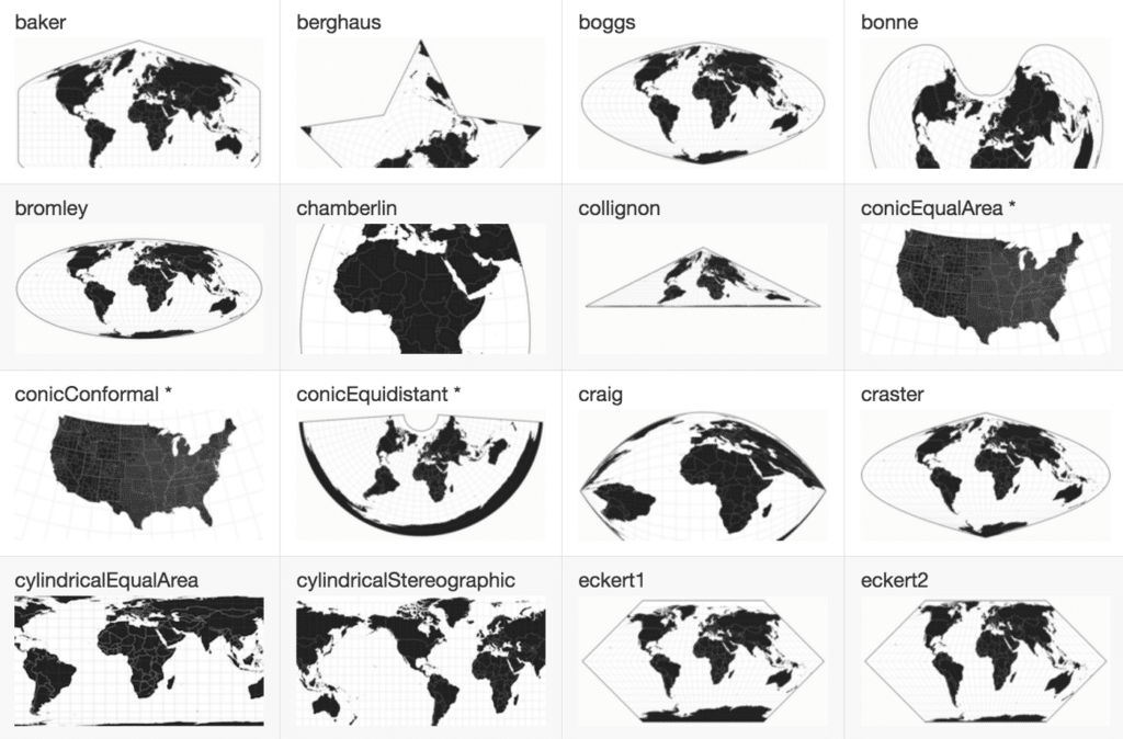
extending projections
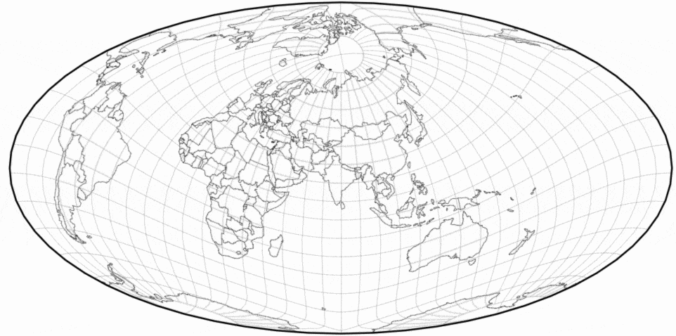
d3 includes an extensive set of projections, and that set can be extended when people implement other projection with d3’s API.
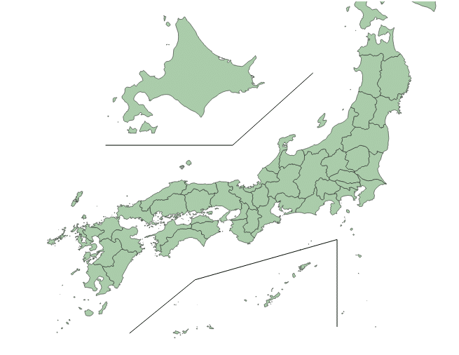
Some countries have territories that are not geographically close, so this library makes composite d3 projections that plot them together.
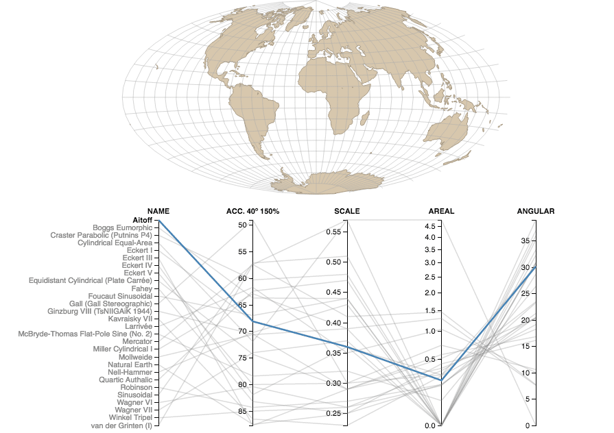
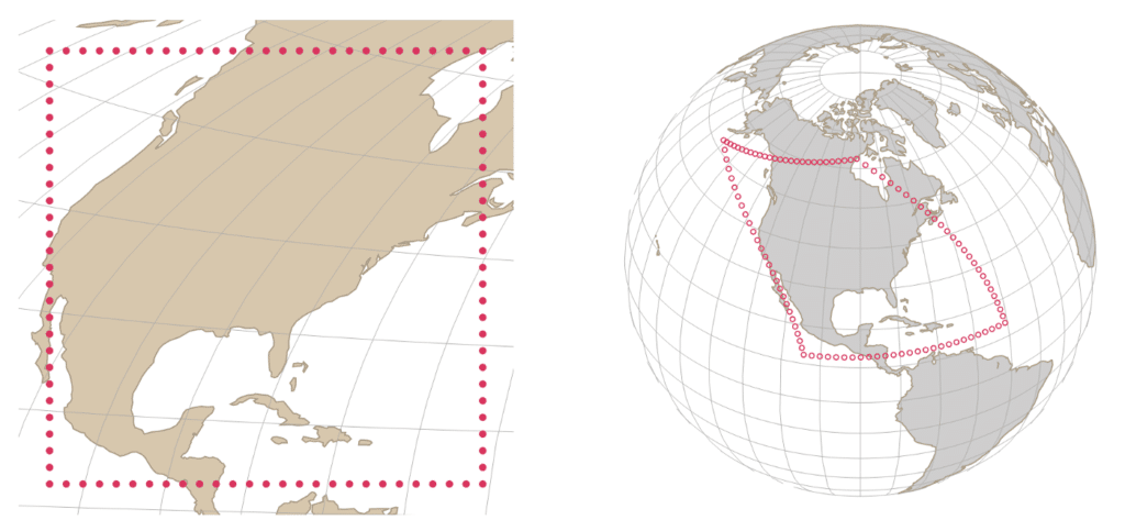
All projections introduce some sort of distortion when they attempt to flatten the 3D globe on to a 2D plane. This example allows you visually inspect the distortion of several d3 projections.
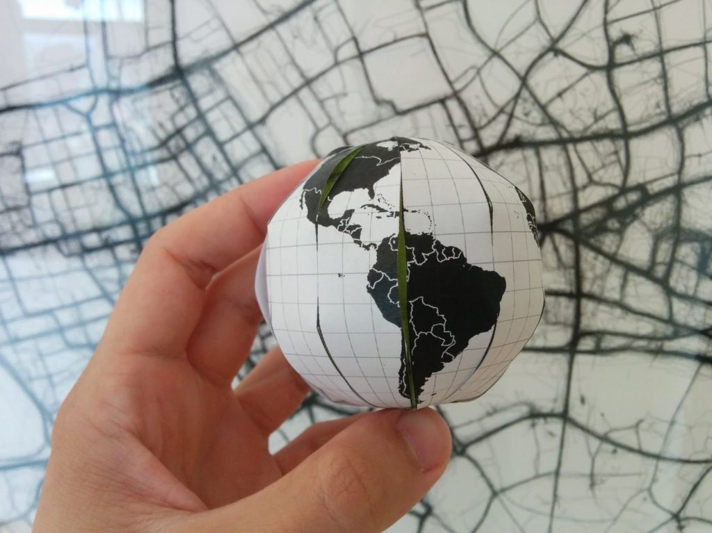
Interrupted projections allow an aspiring cartographer to decide how the earth should be cut in the process of flattening it out, BECAUSE THE EARTH IS NOT FLAT.
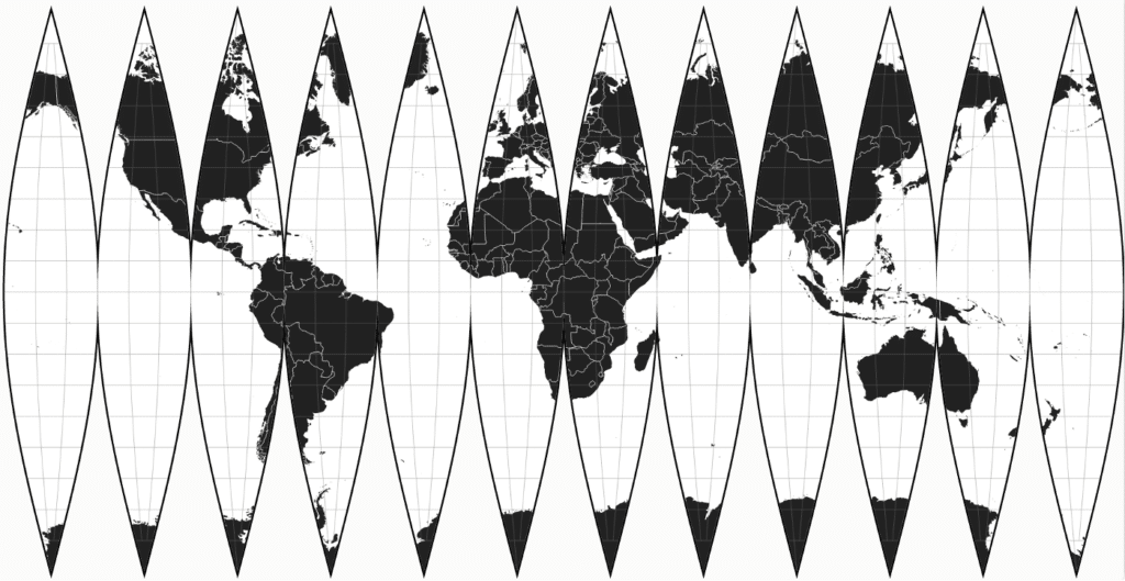
You can actually print out the map and cut along the “interruption.”
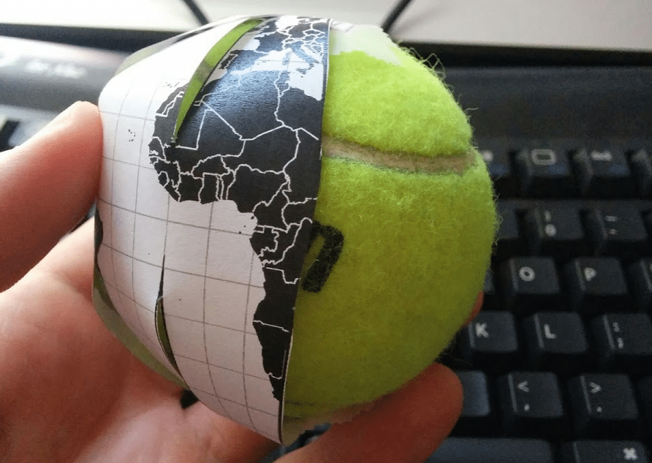
Glue the result to a tennis ball and you’ve created your own custom globe!
custom conclusion
We’ve covered custom styles, data layouts, transitions, geometries, compositions and projections. The real conclusion is that we are just getting started with the potential for geospatial visualization. Use the links in all of the above examples as starting points, and don’t forget to search for more.
If you are in the San Francisco Bay Area at the end of June or beginning of July
Sign up
for our two d3.js & mapping workshops to get a solid foundation in coding and designing with d3.js projections! Read more about our philosophy and methodology behind the workshops.