A project with Stamen and National Geographic
As a child, I dreamed of being a National Geographic photographer. What could be better than going exploring to find just the right perspective to help everyone appreciate and better understand this amazing world we call home.
I never expected that I would partially realize this dream in a completely different way. Instead of a camera’s lens, my tools included code, design, maps, and data. My first project with Stamen was creating an interactive page where users would compare and contrast maps showing various types of human impact across the Amazon Basin. In this way, I collaborated with National Geographic to find the right perspective to help people to explore data to appreciate and understand a very special part of our world.
From both a technical and design perspective, it was an interesting challenge. The goal was to add functionality on a project that had already launched, which brings in a different set of constraints and challenges than starting from scratch.
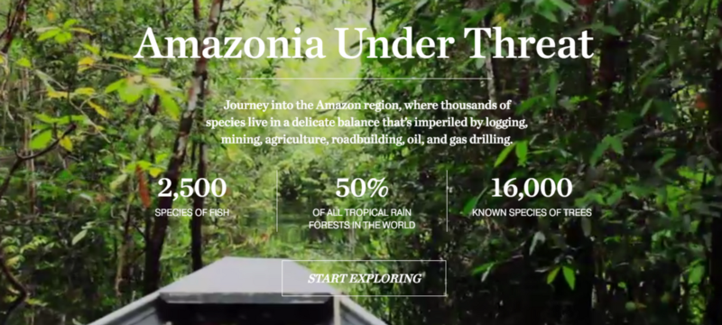
In this beautiful project, viewers are introduced to the Amazon’s water cycle, forest types, forest strata, and varied human impacts. This last section walks them through a set of detailed maps, each highlighting a different type of human impact on the Amazon Basin. For example, the page shown here highlights mineral resources throughout Amazonia.
National Geographic is well known for their map-making, and with good reason. These are wonderfully crafted maps, with careful attention to details about labeling, color, and background context including terrain and rivers. The project was published both online and in print, with shared maps and design between the two formats and between the two collaborating teams (Stamen and National Geographic).
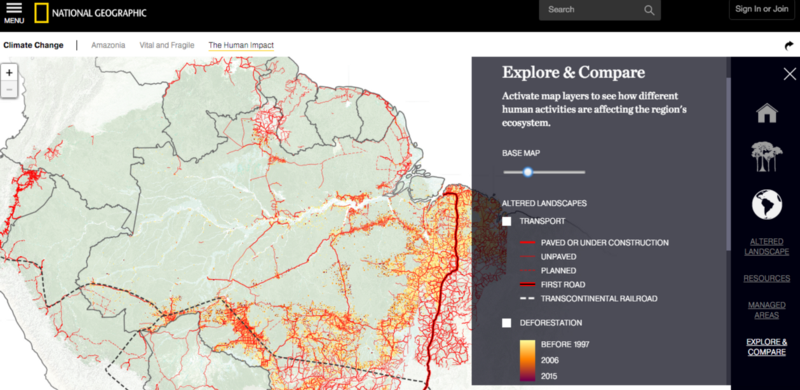
My challenge was to create an interactive page in which users could compare and contrast any collection of these maps overlaid on each other. On the one hand, this isn’t a hard problem. There are plenty of maps in which you can toggle layers on and off. On the other hand, there was so much rich information to show and so many colors that had never been designed to be seen together. How could I keep it from being a visual cacophony?
I had the additional constraint of needing this new page to feel like a seamless part of the already published project, that was both beautifully and thoughtfully designed.
Constraints create good challenges.
My first goal was to identify what “levers” I could pull within the existing code and design framework. I felt like I was on Iron Chef: I couldn’t choose my ingredients but if I could find the right way to use them together it would turn out great.
One major goal was to focus the user on the foreground: the types of human impact data that they would compare and contrast. To do this, I wanted to pull the wonderful rich, contextual parts of the map like terrain and labels into the background without losing that context entirely.
I explored applying SVG filters to the HTML images the make up the map, in order to shift the green in the terrain layers to a more backgrounded grey or sepia. This proved problematic for several reasons. On a technical level, SVG filters are only supported for SVG elements, and not for HTML images, in Internet Explorer. Moreover, this diverged too much from the original design and feel of the project.
Instead, I achieved this objective by creating a slider to control a set of parameters that together brought these layers into the background or to the foreground. Most obviously, the slider controlled the opacity of the terrain base layer and was preset to be mostly opaque when the user first visited. As the slider is increased to full opacity, the terrain becomes an increasingly stronger green, slowly rivers are introduced, and then labels and country borders fade in.
The second challenge was around the selection interface, legend, and how to encourage thematically meaningful and visually compelling comparisons while also providing the viewers freedom to also compare across any types of human impact data.
We started with presenting a mostly blank slate for exploration, because viewers had already been introduced to each type of data they might select to compare. Therefore, viewers first see only the mostly-opaque context layers selected and a legend grouped by them. The legend is both informational and where viewers select data to view. Upon selection, the data appears on the map and the detailed legend is revealed.
We grouped legend items by theme, reflecting the established themes. Layers within a theme had been designed to be viewed together, so we also wanted to encourage those comparisons as they were likely to be meaningful and also visually harmonious. For example, viewing Fire, Deforestation, and Transport layers together shows that many areas that are affected by all three.
We might also notice, that in the center of Brazil, there is an area with a lot of fire where there are almost no roads. Interesting…
Bringing back in the context layers, and we can see that those fires track the Amazon and the river’s major tributaries. Perhaps this is because rivers also enable transportation, just in a different form than roads.
By focusing on the data comparisons first without the context layers, we can observe and explore. Inevitably this inspires questions. With the slider we bring back detailed context layers to help us begin to address our new questions, questions we might not have thought to ask if we were looking at the context and data layers all that the same time.
In addition to comparisons between themes, cross-theme comparisons can also be quite interesting. For example, in some areas it appears that transport (in red) and minerals (in purple) might be related but not in other areas.
Bringing back in the base layers, we can see that the area on the left where minerals and roads overlap is Ji-Paraná while south of Sinop they don’t. This doesn’t answer the question by itself, but could be the first step.
There were numerous other details that helped make everything feel more harmonious. For example, I set opacity levels and ordering separately for each data layer to reflect its color and visual dominance so they’d look best when combined. Also, including hash mark fragment identifiers to the URL to keep track of selections meant that if somebody found an interesting comparison they could share those same selections with a friend or colleague.
Most of all, while I’ve spoken mostly of the challenges, it was great to be adding to something that already had so much good thought and work put into it that I could build upon. I’m happy that a few larger decisions, and many tiny tweaks, were able to make this addition feel like a part of the whole while opening up new opportunities for exploration and comparison. It also helped make a dream come true for me to collaborate with National Geographic, an organization that has inspired me and so many others for over a hundred years.
A huge thanks to Nicolette for her designs and her advice throughout this project, to Seth, Alan, and Eric S for both technical expertise and valuable perspective, to the whole Stamen team for being so welcoming, and for Ryan at National Geographic for being such a great collaborator!
Check out the full project here.