
I was lucky enough to be invited to give the first talk at Visualized 2019 in San Francisco last week. Tamara Munzner, whose book we have at HQ, talked about encoding data. Vetria Byrd teaches dataviz to undergrad students and is seeking to broaden participation in the field. Steve Franconeri discussed principles for annotating visualizations (or not doing so). And the fantastic Scott McCloud, whose “Understanding Comics” I’ve proudly owned and studied intently since 1993, brought down the house with his beautiful closing performance. I was particularly glad to learn about, and blown away by, the work of Barbara Tversky, who’s done foundational work in the mechanics of how people perceive things like arrows on diagrams, and how including or omitting them radically changes peoples’ understanding of what it is they’re looking at:
“When we present simple diagrams, with arrows, we get causal interpretations, without arrows we get structural interpretations. Arrows change meaning.” – Barbara Tversky @BTversky, visual-spatial reasoning expert from Columbia University @TeachersCollege #VISUALISE2019 pic.twitter.com/ohBKjrZ6jr
— Exploratorium (@exploratorium) May 9, 2019
A great time was had by all, and Jen Frazier at the Exploratorium deserves every bit of the thanks and applause she got for putting this all together. More at #visualise2019.
Here’s an abridged version of the talk I gave.
Our first project with the Exploratorium was Cabspotting. We were invited by my friend Scott Snibbe to work on visualizing a feed of live taxi cab positions. Yellow Cab Taxi had cut their dispatcher costs by automating the location of their taxi fleet, and we turned their decision to cut costs into art. This was 2005, and the idea of a live feed of an urban situation was something that caught lots of people’s attention. The project was shown at MoMA, and wound up becoming part of MoMA’s permanent collection. I’m grateful to the Exploratorium and Susan Schwartzenberg in particular for believing in us. It’s had a great run, but I didn’t anticipate that this idea would find its way all the way into Uber’s initial pitch deck, below right…
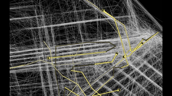

Eddie Elliot took the data we had been working with and did his own investigations. They culminated in a high-res view of 31 days of the data where each minute-by-minute cab track is represented as a semi-transparent dot that builds up to white with multiple passes. They were all good fun, and the image made a huge impression on me. You can see that much of the City’s streets are outlined quite clearly, with a bit of fuzz at the intersections. But in the downtown area, which is full of really tall buildings, there’s a whole fuzzy smeariness to the data that makes it look like the cabs are driving through the lobbies of the buildings:
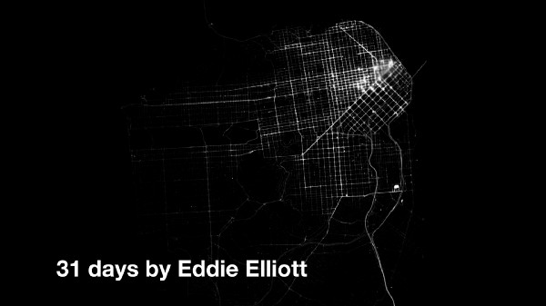
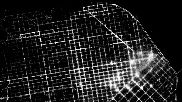
They’re not, of course, and once we’d thought about it for a minute we realized that this was an artifact of two things about a place: 1) it means there are lots of cabs there, and 2) the GPS signals are being bounced around off the tall buildings in the downtown core as the cabs drive around. A light bulb went off in my head. Rather than “fixing” the data to make it more “correct” and match the street grid, what we had here was the opportunity to learn something particular about a place from “visual errors in the data.”
I started talking about this picture as an “Object to think with.” It would work just as well in this instance as “picture to think with” or “map to think with,” but framing it generically as “object” worked best in the end. What I’m trying to claim here is that the very specific way that things look is important. Especially when it comes to maps and data visualization, it’s important to explicitly call out the things that your eyes can do that words can’t. In this work “errors” and “mistakes” are just as important to take seriously as what’s correct. Maybe even more so. Viewing this map as an object to think about the intersection between the built environment and the network lets us imagine new possibilities for how those two might relate to one another.
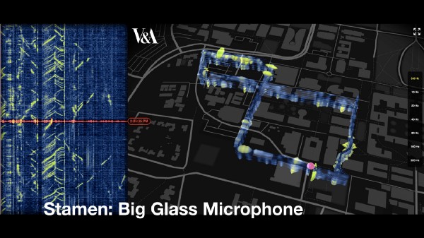
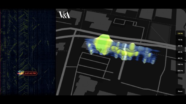
Skip forward thirteen years(!) and this idea of networked infrastructure has taken a whole different kind of step forward. With Big Glass Microphone, a commission we did for the Victoria and Albert Museum’s The Future Starts Here show last year. It’s a data visualisation of a 5 kilometer long fiber optic cable buried under Stanford University.
Vibrations caused by objects moving near fiber optic cables are usually considered undesirable and filtered out as noise; by turning that noise into a signal, we can make inferences about the things that are near the cable, whether it’s a bicycle moving down a road, a cow wandering around in a field or even water flowing from a fountain.
It’s intended to re-evoke a sense of wonder about the kinds of detections and interactions that are increasingly common in our ubiquitously networked society. The object to think with here is infrastructure itself. If a fiber optic cable buried in the ground can tell that you’re walking by, what can the telephone wires over your head tell? What kinds of artistic, urban, commercial, governmental possibilities await as more and more cable is laid to power, say, smart street lights?
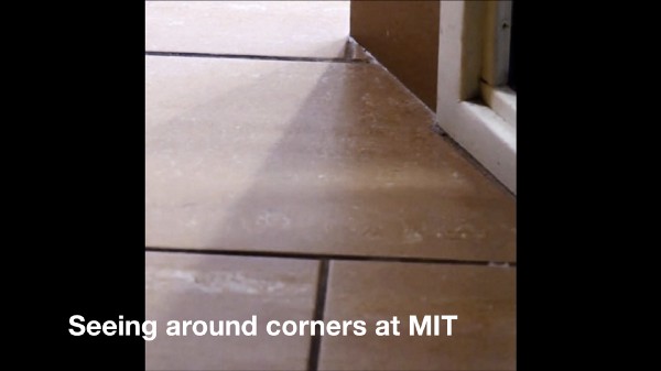
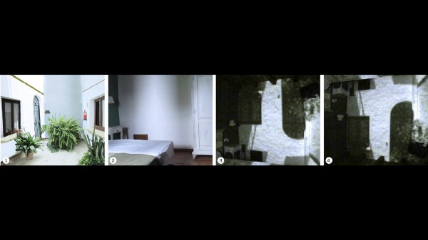
Skip forward another year and we find MIT’s Computer Science and Artificial Intelligence Lab analyzing the light spilling out around the edges of buildings and coming through windows. By applying computer vision techniques to these shadows, they’re able to build a model of what is unseen directly by the camera, but which “leaks” around the corner as you move close to it.
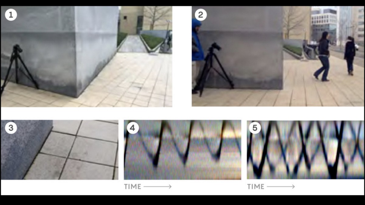
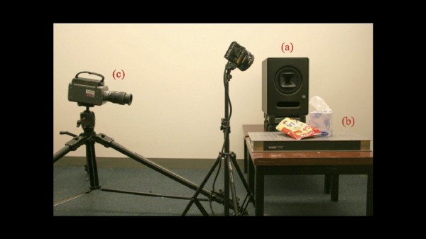
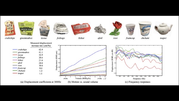
Their work goes further into this analysis of ambient signal, latent in the world around us. A recent set of experiments by the same team demonstrates that video of everyday objects can be analyzed for the audio signals that vibrate them. So your bag of potato chips or the plants in your house can be used as microphones, just by looking at them…
The object to think with here is not a fleet of cabs with GPS sensors in them, and it’s not fiber optic cables that you may or may not be near. It’s the intersection of the network with literally every object in the world.
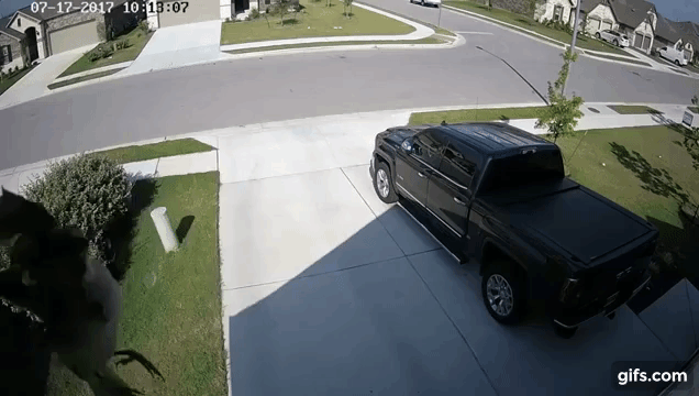
Here’s a flying bird, as seen by a home security camera. The frame rate of the camera overlaps almost exactly with the rate the bird’s wings are flapping, so the bird just kind of hangs there. It seems to me an apt metaphor for what this arc of data sensing points to. The explosion of computation into the built environment is complete. There’s no longer any meaningful way to talk about the border between the network and the world. They’re the same.
So now let’s talk about what’s powering all this computation.
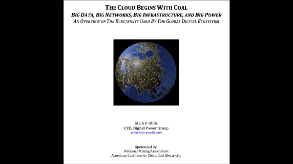
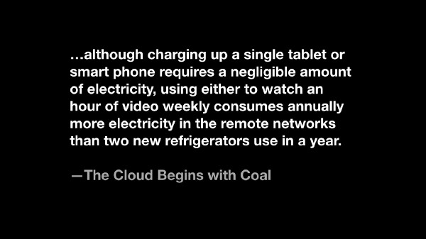
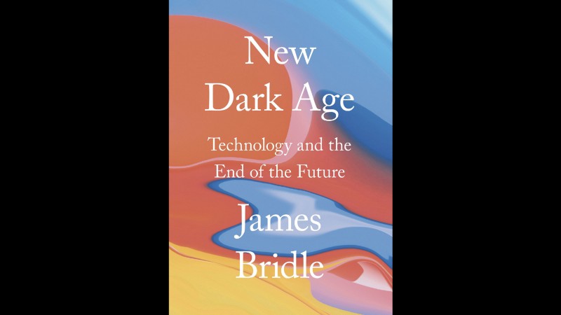
It’s sobering to consider the energy requirements of all the data usage that these and other applications require. There are lots of sources to go around, but a good place to start is The Cloud Begins with Coal: Big Data, Big Networks, Big Infrastructure, and Big Power. It’s a report put out by the National Mining Association, not Greenpeace, so it’s not an anti-cloud or anti-coal piece by any means. I read about it in James Bridle’s amazing book, New Dark Age; more about this shortly.
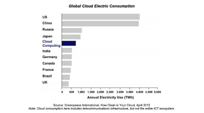
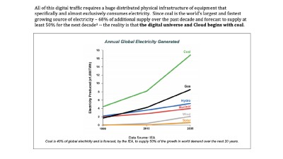
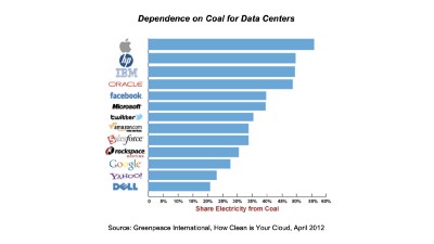
Here are some graphs you might find interesting. The Cloud uses more energy than all of India. The percentage of electricity generated by coal is going up. And many of the biggest cloud providers are powered largely by coal:
Here are two sobering statements from the report:
Hourly Internet usage will soon exceed the annual traffic of the year 2000.
Historically, demand for bits has grown faster than the energy efficiency of using them.
Here are some questions I have:
Does anyone think this is going to slow down any time soon?
Does anyone think this is being planned?
So what are we supposed to do?
Enter James Bridle and The New Dark Age.
James has written some of the most powerful recent work about the network, including Something is wrong on the Internet, which you should read if you care about and want to understand the scale and implication of click-incentivized market capitalism. In any event I was delighted and terrified to read this blurb about the book:
As the world around us increases in technological complexity, our understanding of it diminishes. Underlying this trend is a single idea: the belief that our existence is understandable through computation, and more data is enough to help us build a better world.
In reality, we are lost in a sea of information, increasingly divided by fundamentalism, simplistic narratives, conspiracy theories, and post-factual politics. Meanwhile, those in power use our lack of understanding to further their own interests. Despite the apparent accessibility of information, we’re living in a new Dark Age.
This is a radical refutation of ideas that I’ve cherished since I got involved in the Internet. I’ve bought in fully to the idea that increased amounts of data, and visualizations of that data, have a unique ability to improve human understanding of the world, whether through entertainment or analysis or any of the other amazing things that visualization can do. I’ve based my whole professional practice around this assumption. Lately, I’m not so sure. The state of the world and the network alike seem to be slipping into a new level of unknowablility. So I’ve been spending some time with The New Dark Age, and I think it can point the way toward some answers. Here are a couple quotes from the book that are giving me pause, and also giving me hope.
“The network is continuously, deliberately and unknowingly created. Living in a new dark age requires acknowledging such contradictions and uncertainties, such states of practical unknowing. Thus the network, properly understood, can be a guide to thinking other uncertainties precisely so that they can be thought.”
This feels like an important idea. There is no plan. The network isn’t under any kind of central control. It moves forward deliberately and unknowingly. Those aren’t contradictory tendencies. They’re both essential aspects of what’s happening.
What would an object to think the network look like?
“When one has a hammer, goes the saying, everything looks like a nail. But this is not to think the hammer. The hammer, properly conceived, has many uses. It may pull nails as well as drive them; it may forge iron, shape wood and stone, reveal fossils, and fix anchors for climbing ropes. It may pass sentence, call to order, be thrown in a contest of athletic strength.”
I love this opening-up of the possibility of tool space! I’m on record asserting that data visualization is about more than computer programming, that it’s not a bastard stepchild of computer science. I still believe that. But if I admit it, until I spent some time with The New Dark Age, I still thought at some level that deploying these new tools was about utility and getting closer to the truth, a natural extension of science and facts. I’ve been thinking data visualization as a hammer for nails. But thinking properly about it opens up a whole new range of possibilities.
“Wielded by a god, it generates the weather. Thor’s hammer, Mjolnir, which created thunder and lightning when it was struck, also gave birth to hammer-shaped amulets intended to provide protection against the gods wrath — or, through their resemblance to crosses, against enforced conversion. Prehistoric hammers and axes, turned up by the ploughs of later generations, were called ‘thunderstones’ and were believed to have fallen from the sky during storms. These mysterious tools thus became magical objects: when their original purposes passed away, they were capable of taking on new symbolic meaning. We must re-enchant our hammers — all our tools — so they are less like the carpenter’s, and more like Thor’s. More like thunderstones.” p13–14
I’ve spent 20 years visualizing the data that pours out of the world in an attempt to make things clearer. To build objects to think with. This was all well and good when the subject of this inquiry was cabs in the world, or cables in the ground. But now, the world/network itself is the Object to Think With. In the face of a world where everything, literally everything is connected and a sensor, this project seems simultaneously impossible and absolutely necessary. I’ve arrived at the conclusion that the only sane way forward — the only way these tools can mean anything, the only way they can help us think about what to do next — is if we re-enchant and re-mystify them. Data visualization isn’t just a tool to convince. Logic is not going to solve this problem. We can—must—build tools to enchant.
The World/Network itself is the Object to Think With. I still believe that visualizations, done well, can help us think new thoughts about the world. They point more clearly than ever to the idea that faced with a problem and opportunity as urgent and pressing and unwieldy as this one is, that the fuzzy and unknowable parts are just as important as the crisp parts. And maybe more interesting.
We need to re-enchant the network. And by doing so, re-enchant the world. If not us, then who?
May 20, 2019 if you’d like to learn how to do this work, we’ve got you covered. We’re hosting a Data Visualizations Workshop at Stamen HQ in San Francisco’s Mission District on Saturday and Sunday, June 8–9.