
by Eric Rodenbeck and Keir Winesmith
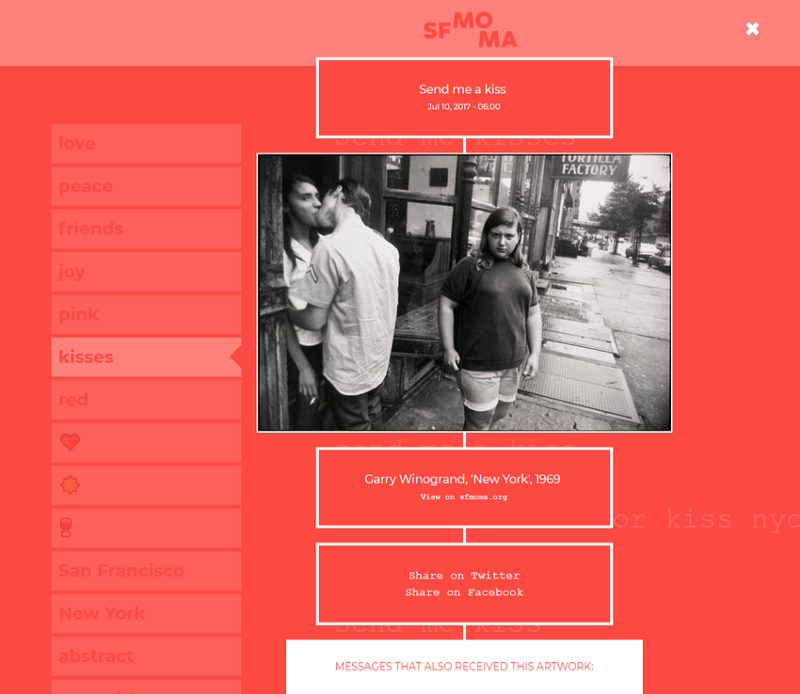
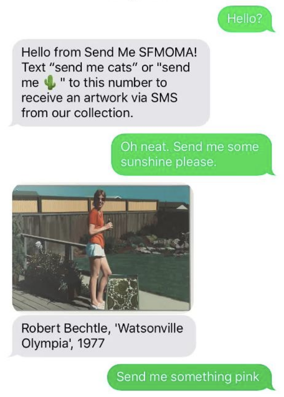
Last June, SFMOMA launched the SMS-based service Send Me SFMOMA. The initiative was conceived as a way to shed light on the museum’s vast collection, only a fraction of which is on view at any given time. Send Me SFMOMA quickly went viral. Over the course of the summer millions of people texted the service everything from “Send me 🙄” to “Send me abstract expressionism” to “Send me a sign” and received artwork images from SFMOMA’s collection. This summer, SFMOMA partnered with Stamen Design to create data visualizations exploring the alternately poignant, deadpan, and whimsical exchanges that have emerged between users and Send Me SFMOMA.
Keir Winesmith, former director of digital experience, SFMOMA: When we started talking about visualizing the Send Me data set, the conversation was pretty open-ended. Where did you, as a team, set out to get to? What was your original goal for this project?
Eric Rodenbeck, CEO and creative director, Stamen: We had hundreds of thousands of people texting a museum to send them artworks, and they’re doing this while they’re embedded in the real world where real things are happening. So we had all these ideas about tracking the number of times that people asked for the word “rain” when it was sunny. Or that maybe there was some sort of inverse relationship between the content of searches and things happening in the world. Or a correlation between the news and the queries people were submitting, and that we could track it, somehow. There were a lot of ideas like that. So we began making a handful of visualizations that tracked volumes of requests over time, and we built search interfaces that let us look at things like requests for “clouds” over time.
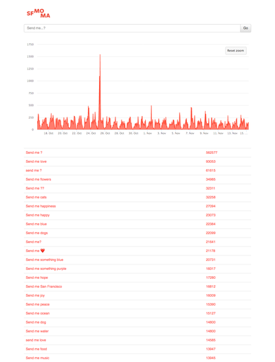
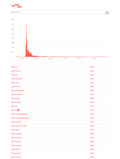
We discovered quickly that pretty much every requested term had about the same shape in terms of volume. There was a big spike when the project hit the Today Show and a bunch of other news outlets, but the volume was more or less even over the remainder of the project. So it wasn’t going to be all that interesting to try and discover something measurable about the outside world that was demonstrably verified in the data set.
KW: We were interested in documenting elements of the project that make it personal. You don’t interact with it through a web interface or an app, and it doesn’t happen in the museum. Everything happens via SMS. The data comes from people sending text messages using the same technology that they would use to communicate in a very immediate way with their loved ones or friends. And so we thought the project would have a personal bent. Maybe it’s more self-reflective late at night, or maybe more positive on a sunny day? Or full of 👻 during Halloween? So we were surprised to see how “normal” the data was. Part of that is because we actively chose to anonymize all uniquely identifying information, which meant we anonymized the three-digit area codes that might have told us what part of the country people were texting from. I believed that we would be able to draw out connections to the outside world, but that didn’t come through so clearly in the data.
ER: I love this idea that you get art using the same medium that you use to arrange dates or hear from your bank. I mean this very kindly: this is the dumbest way to interact with a museum collection I can think of. What does it even mean to communicate with a museum via your SMS service?
KW: It means that the words people use are key. We now have a rich gap analysis of how the words that we as a museum use to describe art are different from the words people use when they want to connect with and discover art. Now we can ask: What are people looking for? What words are they using, and when do we have no answer for them? Or do we use a very academic version of the word they use? So it’s like a gift. A gift to us from our audience.
When Stamen started the project, you gave us a bunch of design ideas that felt really sketchy, really brushstroke-y. For Jay Mollica (creator of Send Me) and me, those early prototypes dissuaded us from the direction we were trying to push you in. You showed us designs that we’d asked for, and it was clear that they wouldn’t work.
That approach of experimenting first, without a defined destination, was one of the reasons we were attracted to working with Stamen. It’s also normal behavior within SFMOMA Lab. Sometimes the right approach is not to name the exact destination for a project, but to set out the process we’re going to take and who we’re going to work with, and the sorts of outcomes we’re looking for. Let’s call them guide rails. And let the process guide the team to the eventual outcome.
One of the early visualizations was a web-based 3D representation of hundreds of thousands of text messages that a user could query in real time. And you said, “But it doesn’t tell the story, so we’re not going to use it.” So we threw it away and came back with other ideas. That was refreshing.

Stamen Design, protype of Send Me SFMOMA data visualization; image courtesy SFMOMA
ER: We try hard not to be precious about our ideas. Speaking of the project as a gap analysis tool for how the museum is spoken to by its visitors: I love that. We like to use visualization as a gap analysis tool of the whole process! Sometimes we have to show you precisely the ways in which the idea doesn’t work in order to move forward. And you can talk about it all you want, and you can write all the briefs you want, but until you see it and you realize, well, it’s actually kind of boring even though it fulfills the brief, then that’s where the real learning can start. My pal Nick diPalma often quotes Megan Smith, Barack Obama’s CTO:
“Don’t think about it too much. Just start, because you won’t learn anything until you do.”
KW: Some of the things that are sublime in individual texts, or in one person’s series of interactions with the service, are not there in the aggregate. We got a great note from someone living in a part of the US where it doesn’t rain very often, who had texted “send me rain” every day for months on end until it did rain, and recorded the artworks they received. Luckily there’s a lot of rain in our collection. Another person made a small poetry book out of the messages they’d sent and the responses they’d received. They sent us the chat book, not for us to publish, but just to say that it’d been an inspiration. So there are these very personal through-lines that get flattened out over four, almost five million text messages. What did come through, I think, was the words themselves. And when you hit on this way of looking at the words as connectors, as a kind of stream of consciousness, that opened up some doors. Can you describe where you got to?
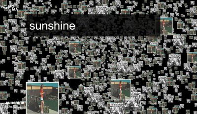
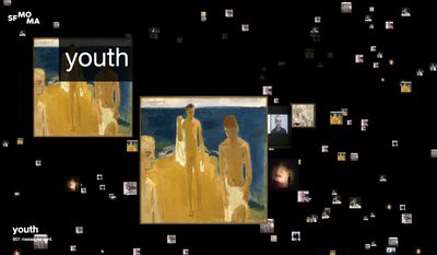
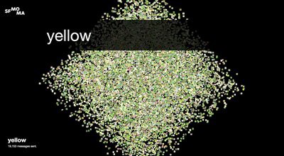
ER: We realized that showing lots of pictures of art wasn’t interesting. We’d done another project with SFMOMA, ArtScope, where it was very much about the artworks. We had been doing all this metadata analysis and looking at when artists were born and died, and found some good stuff. We made visualizations of the sizes and shapes of all the artworks in the collection. And that was kind of interesting. But not gripping or novel.
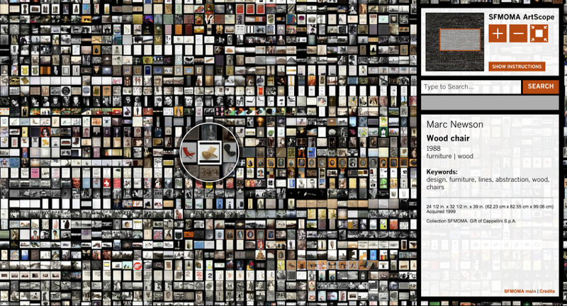
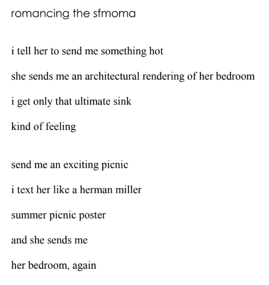
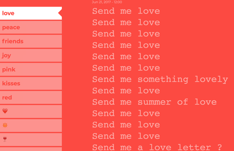
What was interesting there was very simple: “Let’s just look at pictures of everything that’s in the collection on a giant map of art, organized by when it was acquired.” It turned out well. This time, because there was source material that wasn’t just what was in the collection, there were potential connections between things that we hadn’t considered. Looking at what happened when people said “send me love” was sort of interesting. But when we looked at what happens around that request for “love,” we found things like “send me love in all the wrong places,” “send me a friend that I can love,” “send me love that won’t hurt me.” And that started to become very interesting, to compare the initial searches to the searches that followed them and see where things led.
What you start to get is this weird poetry of need or of desire in summary, because people are saying, “send me [something].” They’re asking for something. They want something. Then we can start to answer questions like: What do people want from art? What do people want from museums? And the only way that that came through was, again, by struggling with the analysis of it.
The psychologist Paul Ekman, who we’ve worked with on projects for the Dalai Lama, has told me that he practices a kind of science that’s not common these days. It’s the science of looking, of observation with just your eyes. You don’t go into a lab with test tubes, but simply sit still, and look at something. In some ways, I feel that’s what we were able to do with this collection through the project. Just look at the data. Look at what was actually there and suss out what was interesting. And a line graph was not it! The ways in which you could associate love and friendship and desire with a museum’s collection came out through the words.
KW: What unlocked that for me is when we were looking at demos that included moments when someone sent a series of text messages, a series of requests, and one response provided something unexpected.
It’s not a search engine. You can’t request something specific that you want. It’s a sublime engine.
ER: A sublime engine! I love that.
Twitter users respond to Send Me SFMOMA
KW: When you’re sifting through other people’s moments of connection, it’s another act of discovery. When I was playing with what you had created, I found myself, first, trying words that I’d sent myself, to see what other people received. In doing so, I saw people using language in very thoughtful, funny, silly, irreverent, and painful ways. “Oh, what did they say? That’s wild! What did they get for that?” To relive their moments, but then also be able to generate my own.
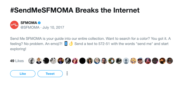
I think the shareability is beautiful. We noticed that people would crop what we sent them and post the results on Facebook, Twitter, etc. Or text or email things they’d received. I received a lot of direct messages from friends and family, which I see as exemplary of the recent change in sharing behavior as people move to private networks of group chat and individual messages rather than doing everything out in the open through platforms like Facebook.
The challenge was to create a data visualization of something that is a surprising, fun experience rather than a massive aggregate. That was the success of the project for me.
ER: That’s something we talk about fairly often, that data visualization is about more than expressing concrete facts to a neutral audience. It’s a communications medium with many different kinds of approaches. There isn’t one correct way to do it. Data visualization can be as expressive as photography.
KW: Agreed. One of the reasons we specifically looked for partners to help us to do visualizations around the project is that we’re too close to it to be good narrators. When I think about technology’s role in a museum context, I often think through the lens of usefulness. A lot of what we do is provide a utility: understanding what a visitor is looking to do, and helping them out by meeting them where they are, acknowledging their motivations, and trying to help them achieve them, whether they are looking to learn about an artist, discover new artworks, or get to the bathrooms. Trying to move further away from language of visitation and toward a language of usefulness. But I don’t think you need technology to do that — I don’t think innovation in that space is necessary or sufficient. What’s more important is understanding audience needs and acknowledging them, respecting them, and then trying to meet them.
ER: That characterizes the whole project, right? Not for you to learn about art and then come to the museum and show us your knowledge, but we’ll come to you via SMS.
KW: And hopefully, along the way, we’re contributing in a small way to making the question of what an art museum is more messy and nuanced.
ER: Where does the SFMOMA collection data come from? How is it generated?
KW: Our colleagues in the Collections Information Access (CIA) department, working with curators, researchers, artists, donors, and estates, have been adding and improving data on our collection for decades. Luckily for us, CIA staff members have spent the last ten years adding wonderful descriptive language tags to the artwork records. They didn’t know we were going to build Send Me SFMOMA years later. But because they did that work, we had the chance.
ER: We originally thought that we were going to come to a better understanding of the project through visual analysis. And we’ve instead made a change to where we’re not just visualizing the number of words, but using the words themselves as the raw material for the data visualization. I love that. I mean, it’s not just a word cloud, right? We’re at a different place now than when this medium first started to take off. That’s something that I think about a lot, what the role of data visualization is now that everybody knows how to do it.
KW: It’s not quite at the level of photography, where everyone can take a photograph and look at it straight away and then retake the photograph. But data visualization tools are much more available and easy to use.
Having those tools in the hands of many does a few things. First and most importantly, it normalizes data visualization as a communicative medium. It’s available. You don’t have to explain what it is or even tell people why it’s important. But to be compelling, we need to get to a place where data visualization is just as effective at storytelling as a well-written article, a photography series, or a short video. Stamen showed within a week that you could do all of the obvious things, but neither of us was happy with them. And so we spent the next month getting down to the hard work of creating something deeper and more interesting.
ER: We have to be willing to learn from each other. That’s the key to it. It’s not just a bunch of people in a room throwing around random ideas. It’s an actual process of learning. I love that.
KW The best partnerships are those where people feel free to be curious instead of precious. And that exemplifies everything that Stamen has done with us. We give ourselves permission to say, “Okay, I wonder where we are going to end up? This is going to be great.” And if we go down a cul-de-sac, we acknowledge it and move on. That’s the best stuff.