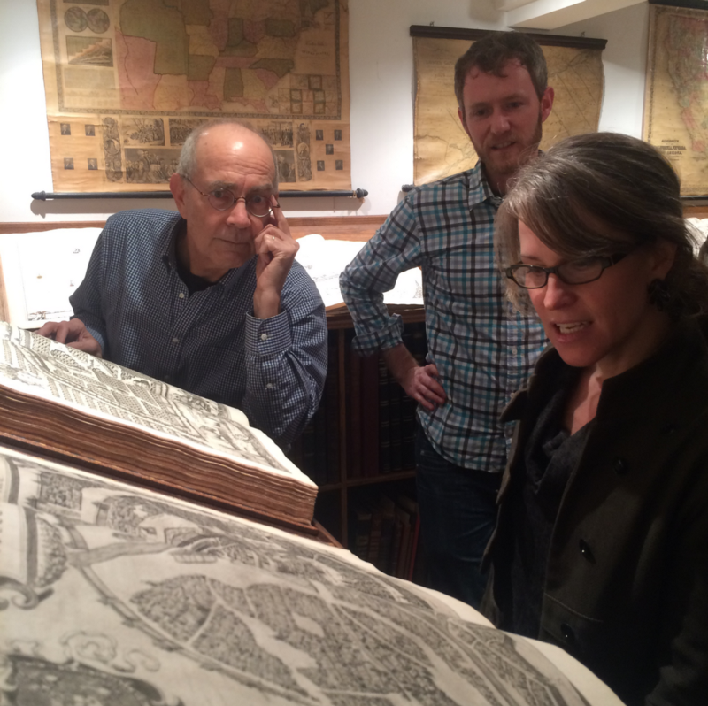
Last year we got to pay several visits to David Rumsey’s amazing map library in his basement in San Francisco’s Cole Valley. At that time it was the country’s largest collection of maps in private hands.
It was the coolest room in the whole damn world.
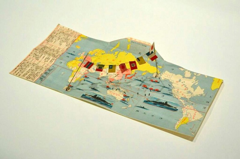
David had thousands of atlases in there. Hundreds of globes. Atlases for the blind. Gigantic collections of watercolor drawings of the Grand Canyon. Ten foot long painted maps of the seven principle rivers of Asia all flowing in to the navel of the world. Wood-block maps hand-annotated in red ink. Swiss mountain ranges, medieval Paris with every house drawn by hand, just incredible detail. The sheer volume of material and the breadth of the collection was just staggering. And in between and among all of that were gems like this, a Japanese postcard commemorating the attack on Pearl Harbor, which I guess you were supposed to send…celebrating the battle? But the kicker is when you open it up, these two little pins stick up, WITH NAZI AND AXIS FLAGS HANGING FROM THEM:
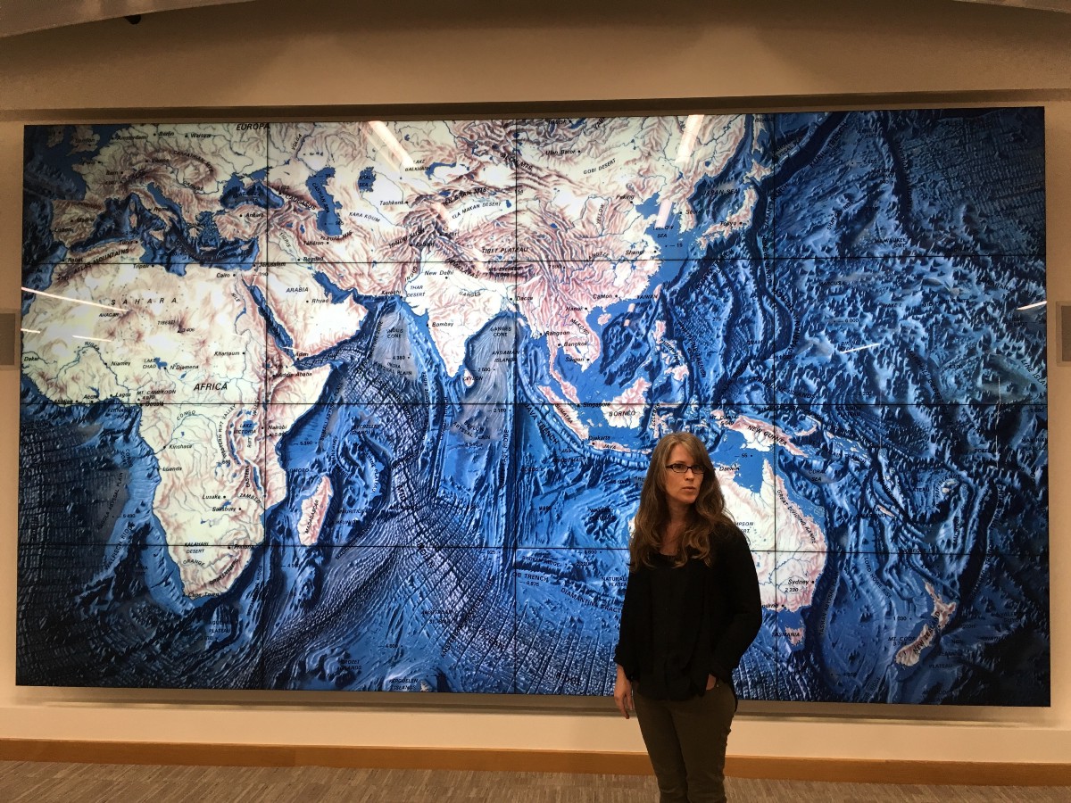
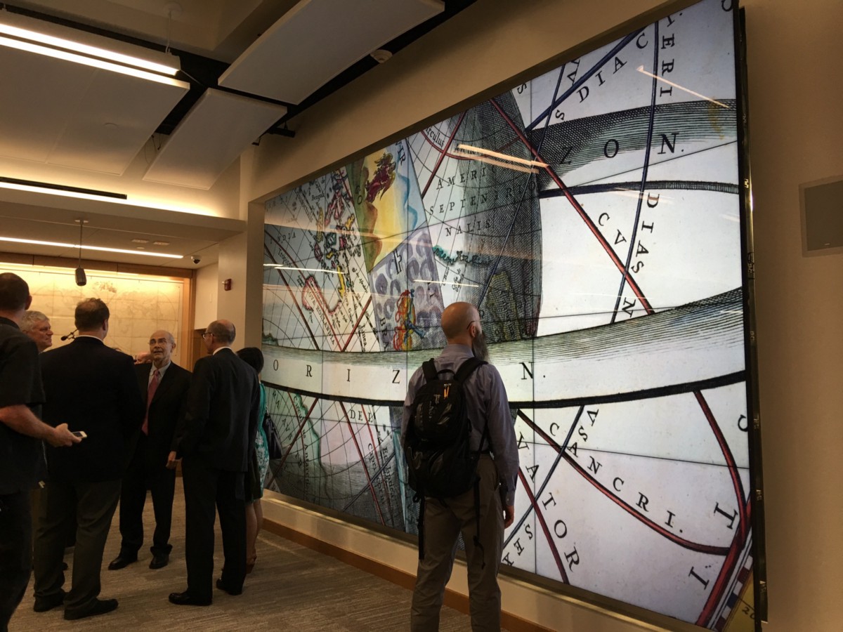
All of these maps are now down at the new David Rumsey Map Center at Stanford, which opened to great fanfare last month. Wired called it “the dopest map collection on earth.” It’s a terrific space, is open to the public every weekday from 1–5, and you can explore the collection both virtually and physically. AND it has gigantic screens on the walls with interactive map applications on them designed by…us!
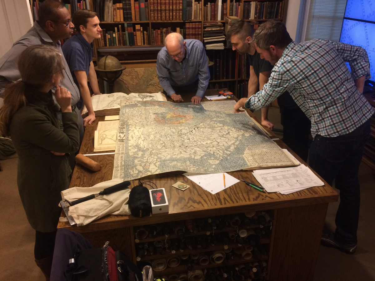
It’s not easy to describe the experience of interacting with a map this big. At some point the map extends past the edges of your peripheral vision and it’s easy to feel like it’s wrapping itself around your consciousness. A couple of times during the project I actually felt myself getting physically overwhelmed by the scale of what I was perceiving, especially because of the overwhelming amount of detail in some of these bad boys (like this one, a huge 180-sheet map of France).
It’s great that the maps have the protection of Stanford and that the public can access them now. But I have to say, I’m sorry I was only able to spend a limited amount of time interacting with that incredible collection before it left that fantastic room.
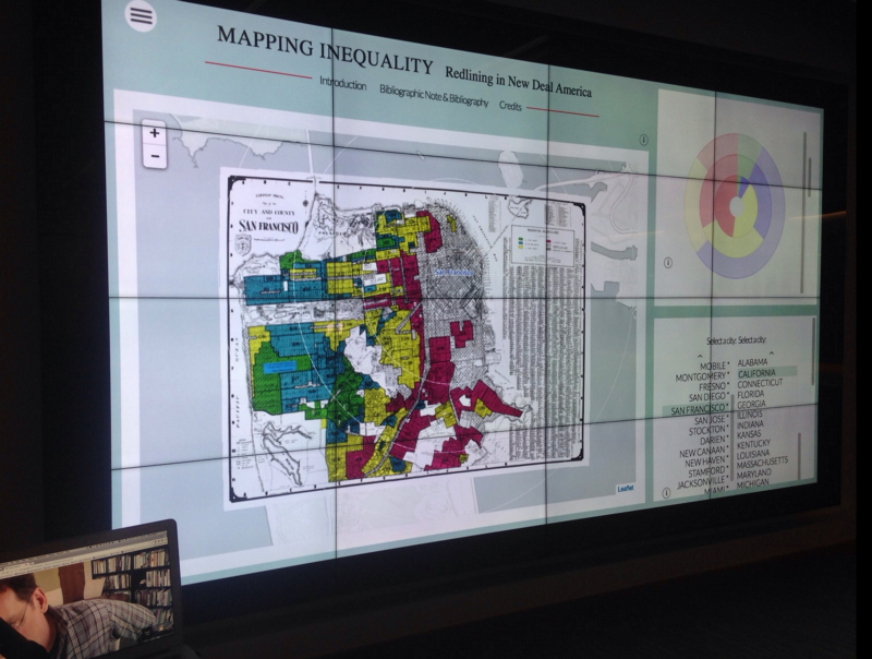
If there’s any silver lining here it’s that the Rumsey Map Center has become a place where we and others can use these giant screens to talk about maps. We recently gave a presentation on our American Panorama project, and Rob showed some work he’s doing now with the library of open source code we wrote: maps of redlining, the racist mortgage practice of denying services to residents of certain areas based on the racial or ethnic makeups of those areas. We’re looking forward to going down to visit often!