
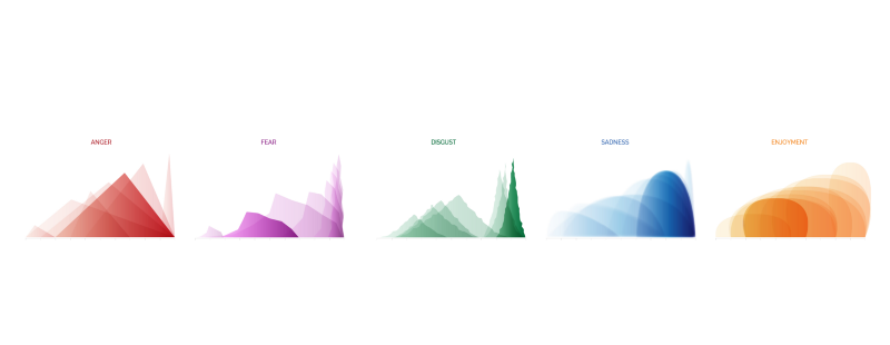
While many types of visualizations strive to be easy to interpret, the “charts” representing the states of each of the 5 emotions goes further. The reader should get an impression of emotion and intensity of emotional states without ever really consciously interpreting it.
Different states of anger, like fury and annoyance, are represented by red triangles. In contrast, states of fear are purple faceted waves which “feel” very different than sadness’ soft, heavy blue bubbles or disgust’s green glops.
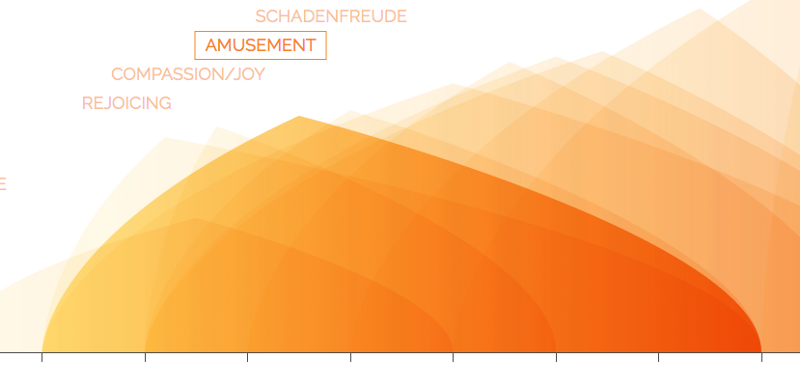
Additionally, the fact that fury is distinct and pointy and set far to the right should give a sense of high intensity compared to annoyance’s smallness.
The Atlas of Emotions was a wonderfully collaborative project. In Embracing the Abstract in Data Viz, Nicolette Hayes describes her iterative process designing these shapes. Beyond the original design, defining and creating these shapes in the browser offered some interesting technical challenges, especially since they needed to animate and fit a full spectrum of aspect ratios. Throughout the rest of this article I’ll share some of the visual effects that helped give this intuitive sense of an emotion, the ways I addressed various challenges, and what we learned in that process.
Encoding intensity
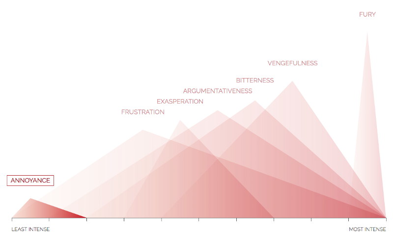
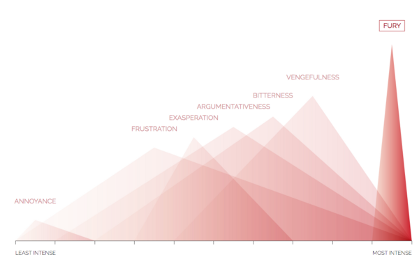
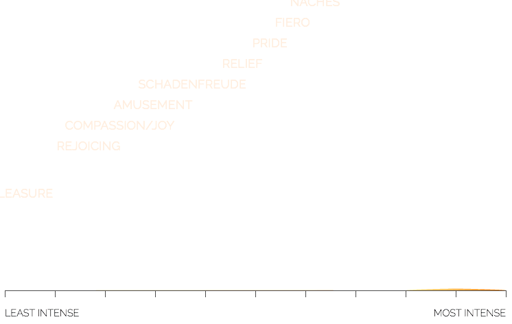
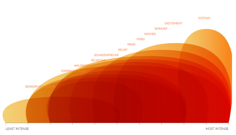
For all 5 emotions, each shape is simply a variation of a theoretical triangle in which the corners mark 3 meaningful points. The left and right corners of the base show the minimum and maximum intensity of that emotion, while the height shows the average intensity. For example, an intense state of disgust, like loathing, is very tall and far to the right. In contrast, dislike is of mild to middle intensity so is shown on the left side of the graph, with a wide base, and isn’t very high. These aren’t meant to be exact quantified values, but indicative of the differing intensity of different states of an emotion.
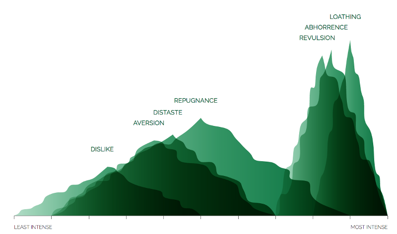
In addition to position, the increasing intensity from left to right is reinforced in the color gradient from left to right within each state shape.
Creating a shape that is a feeling
While intensity is encoded the same way in each emotion, the shape, animation, and color are designed to be different — to match the emotion that they embody.
How do you make a shape that gives a qualitative sense of an emotion? How do you create a shape for fear?
Moreover, because of the entering animation and varied aspect ratios, the shapes had to be automatically defined based on the 3 “corners” of the underlying defining triangle. They couldn’t be brought in as a single image or hardcoded in some simple way.
A core technical challenge
Challenge: Start with 3 coordinate points and use those to define a path (with math) to create a shape that has a feeling.
When I started on the project, Nicolette had already created a set of amazing designs in illustrator and Eric had implemented a working version for each in D3. However, for several of the shapes, we wanted to go further — to get closer to Nicolette’s design and create a shape more specifically designed to match that emotion.
Fear
Nicolette’s original design for fear’s states had hard edges with varied angles which created a sort-of faceted wave shape.
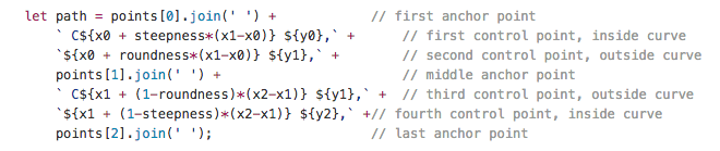
In D3, Eric defined the control points for bezier curves to capture the wave form of the shape. He directly constructed the path string based on calculating the values for each control point.
But, they were still too… beautiful. They literally didn’t have the ‘edginess’ we were hoping for. He left a note in the code:
// TODO: degenerate per “Roughen” Illustrator effect (or similar)
I looked at roughen, but it wasn’t clear what math was behind the effect. Instead, to get closer to the design ideal and get more of a sense of the angularity of fear, I decided to facet the edges. My goal was to keep the overall shape, but break the smooth curves up into a set of line segments.
In short, I wanted to define a point ~30% and ~60% of the way along the curve, and then draw straight lines between those points. To do this, I needed to get the x-y coordinates of the points on this path.
But, how do I calculate the x and y values for those points?
One option was to construct a curve, and then using PointAlongPath to get these points. There was a few reasons why this wasn’t ideal, especially with the animation. Instead I wanted to calculate the points directly if possible.
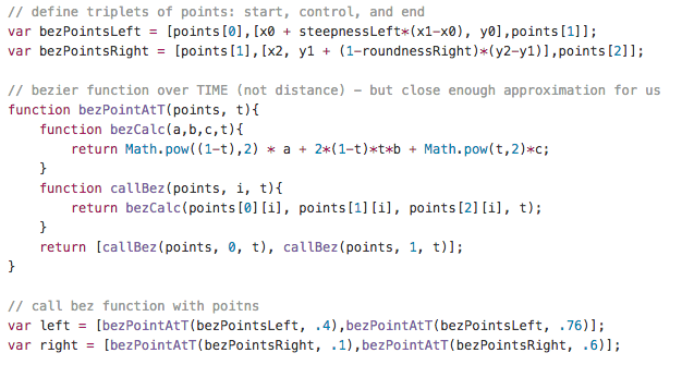
To do this, I started with the original control points that Eric used. Then used the actual bezier function, as defined on Wikipedia.

Jason Davies has a nice animated illustration of how this works. A quadratic bezier is defined by 3 points: P0, P1, and P2. Additionally, these functions are “parametric”, so they’re defined by a variable “t”. Each value of “t” between 0 and 1 represents a point along the resulting curve. To construct the whole curve, you calculate the value of B(t) for all values of t between 0 and 1.
Based on how these curves are defined, when t=0.3, it doesn’t actually mean that the resulting point is 30% of the way along the curve. It turns out that finding the point that is exactly 30% of the distance along the path takes a lot of calculation which can be difficult and slow.
However, I didn’t need mathematical exactness in this situation. Close was close enough. So, I simply input specific values for t to find points that were part of the way along the left and right curves, which made for a very fast calculation. Then I adjusted to find values of t that looked “right.” In the end .4 and .76 worked well on the left, and .1 and .6 for the right side.
Then I stitched the resulting points together to define the path, with straight lines between the points.
The crux of this solution was:
(1) realizing that I could just use the original mathematical function, rather than the browsers implementation of bezier curves
(2) mathematical exactness wasn’t required in constructing these faceted edges.
The original design had some convex facets, as well as concave. My initial experiments with this were unsatisfactory, and we were satisfied with this expression of fear. So, it was time to move on to disgust.
Disgust
Disgust was designed to have uncomfortably uneven edges.
Eric had implemented a placeholder shape for disgust, but knew we wanted something less clean and more … disgusting.
To get this sense of uncomfortable unevenness, I started with a triangle, found a bunch of points randomly dispersed along the edge, offset these points from the edge perpendicularly, and then drew a smooth curve between the new points.

In this method, there were a number of parameters, or “levers”, I could pull to tweak the feeling of the shape. Things like the number of points along the edge, how far offset they were, how much I varied how I placed the points and offset, how I interpolated between the points, etc.
This gave a lot of ways to adjust the shape: from my first attempt, through iteration, to something we liked, to going too far… and finally deciding on a great set of input parameters. The best way to see this iteration is to follow the conversation Nicolette and I had.
One key to disgust was creating a system where I could easily tweak parameters to change the feeling. The other was knowing when to stop.
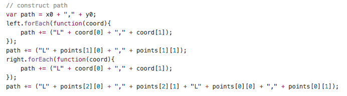
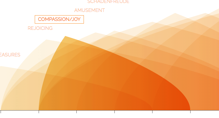
Enjoyment
Eric had originally implemented a beautiful set of bulbous enjoyment shapes.
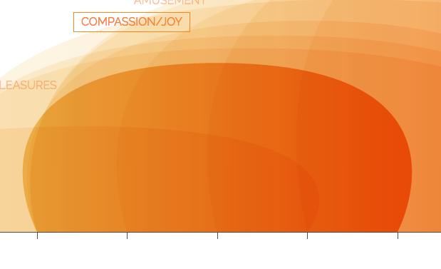
The only problem was that they were so big and there were so many states of happiness, that they overlapped each other on the chart to become sort of a blur. It was also hard to match the shape to it’s label.
Therefore, Nicolette designed an alternative shape in Illustrator, which I implemented in SVG.
Both implementations were based on using the 3 original points to defining some control points, thereby creating the path string for the shape.
The main difference was: (1) the position of the control points and (2) that I repeated the middle point in order to get the point.
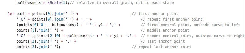
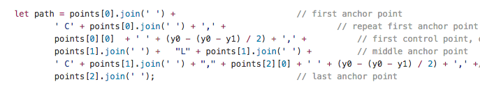
To figure out where I should place the control points, I looked over Nicolette’s shoulder. She literally showed me where they were located in her version in Illustrator, and I generalized this.
The key, in this case, was respecting the fact that just beneath the surface of beautiful illustrations in Illustrator is a whole lot of math. Seeing how the shapes were constructed in one tool showed me how I should define them in SVG. It’s also interesting that two fairly different shapes could be created from very similar code, just by adjusting the control points directly and repeating the middle anchor point.
Final Thoughts
One of the most wonderful parts of the javascript package D3, and the web in general, is that the math is close to the surface. So you can literally draw with math. This may sound quite abstract or un-feeling, but in this case it was the key to creating shapes that conveyed an intuitive sense of a feeling.
For me, it was also a creative exercise, to think about what the crux of the challenge was and what abstraction best defined each shape that Nicolette had designed. And, how could I generalize that abstraction.
Additionally, in some cases, like fear, being imprecise was no problem, while for disgust small changes in parameters meaningfully changed the “feel” of the shape.
Lastly, while Adobe Illustrator is generally thought of as a tool for designers it actually exposes a lot of the math behind the scenes. For example, by showing the actual control points for bezier curves. So, the design itself can be a great starting point for writing generalizable code.
The shapes of emotions weren’t the only part of this project in which the design challenge and technical challenges were intertwined. To find out more, read Eric Socolofsky’s Finding Calm in the Atlas of Emotions.