
We recently designed a habitat explorer for MPG Ranch, one of our favorite clients. It’s a dynamic system that helps their scientists communicate about the exciting restoration and other work that they’re doing on the ranch, using the latest web-friendly tools and techniques.
Eric Rodenbeck (ER) I’m here with Nicolette Hayes, and we’re talking about some new work that we’ve just launched with MPG Ranch in Montana. What’s the rumpus?
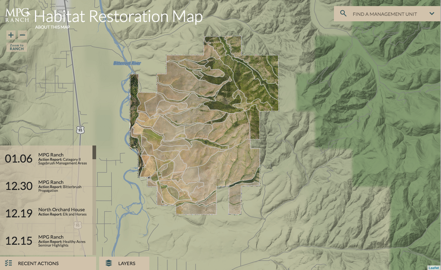
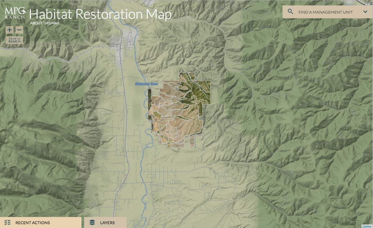
Nicolette Hayes (NH) We designed the MPG habitat restoration map so that the scientists working at the Ranch would be able to keep track of their projects that cover a lot of land. They’ve got a huge piece of property in western Montana, and they need to keep tabs on all the different work that’s happening there in terms of conservation. There are close to 30 scientists and conservationists working to return the land to the way it was before it was used for grazing. Each plot has different kinds of projects happening on it, from heavily wooded summit forests to overgrazed hillsides. The scientists also have a lot of different goals and constraints that they need to track. Before we took the project on together, that information was being tracked by individual departments, and there wasn’t a centralized location for it all to live.
ER And why is it important for it to be central? It sounds like one issue is that they weren’t communicating about the totality of their work to the ranch management very well.
NH Yeah, with the long days that they do out in the field, and with people running around over 10,000 acres, it’s really hard for them all to get together and see what the other groups are working on. But also they have the ranch ownership to think about. They access everything on iPhones from all across the country, and want to be able to quickly take a glance at the ranch and see what’s happening, what’s changed, what’s new. And this is a place that we could put all that information.
ER And you visited the 10,000 acre ranch in Montana, right?
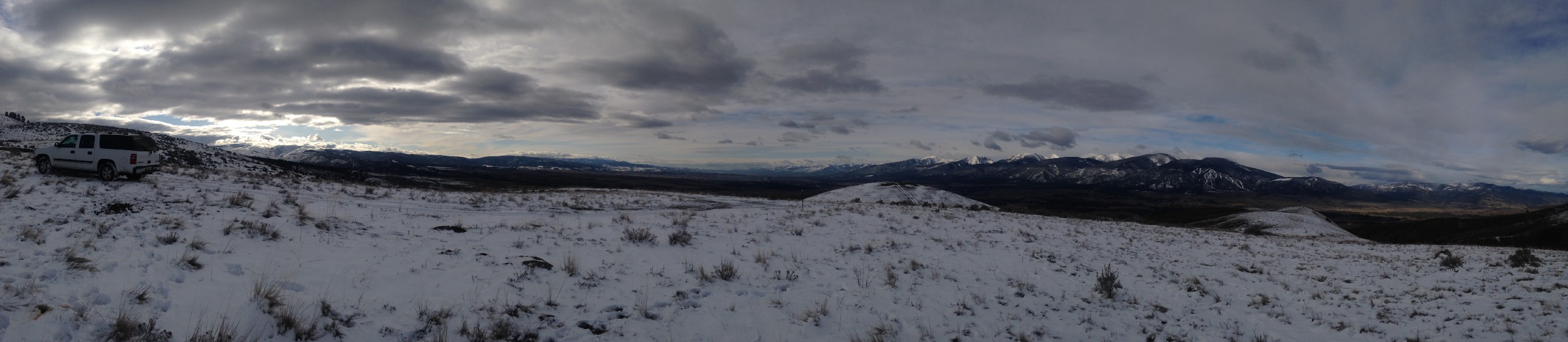
NH Yes, and they took me on an amazing tour. We drove up from the north entrance down in the valley and into the mountains. There was a herd of roaming elk that had managed to collapse one of the roads and we saw wild horses and all kinds of fun restoration projects. There were trees being planted along some of the roads that we were on, and osprey nest platforms along the river.
ER And so they’re actively restoring their ranch. That’s their work. And it was used as a cow ranch?
NH Yeah. It’s the same thing that happened all throughout the American West, so it’s a very interesting model for what could happen in the rest of the country. There’s a lot of invasive grass species that have taken over the plains — probably as a result of the cattle and sheep grazing that happened for many, many, many years — and there’s lots of cow grazing still happening all around them, some of which is much more sustainable than it used to be. But, yeah, they wanted to bring the land back to something that was more ecologically balanced, and they’re starting at various sites.
ER So it’s pretty amazing. They’ve got close to 30 scientists there, just full time managing this property, right? And reporting on it and doing it in a way that’s sustainable and doable long-term?
NH Yep.
ER When I’m just looking at it on the map, it looks like about half of the ranch has trees on it and half of it doesn’t — a little bit more than half doesn’t. But they’re working on that?
NH It’s complicated! A lot of it is rangeland which is not necessarily supposed to have trees on it.
ER Right. There’s some high grasslands and stuff, I see here.
NH Yeah. So I think the more wooded areas in the draws, and along the waterways, those are intended to have trees on them. But some of these are more exposed slopes. The goal is more to have grass diversity and less of a monoculture from all the invasive species so that you have some shrubs and some grasses and therefore habitat to support all kinds of other species. So it’s incremental improvement that they want to see, not a complete shift in the type of habitat.
NH Part of the challenge of this project was that we started out mostly with just a description of what the data would be and with the understanding that the data would trickle in as it was collected. I’m really glad I got to work with our developer, Chris Henrick, who had to put together an entire system based on the placeholder content. And now that the data is all coming in, we’re all seeing all the ways that it can be used outside of what we even imagined.
I think we were probably halfway through the project before we even had the idea to have a polygon for the entire ranch, so that MPG could have a way to talk about things that were about the whole property. We’d been so focused on the granular data! And then all of a sudden we’re like, “Wait a minute. What about stuff that corresponds to multiple polygons? How do we talk about those still important things?” So that’s an example of that push/pull between content and design, and making sure that one doesn’t limit the other.
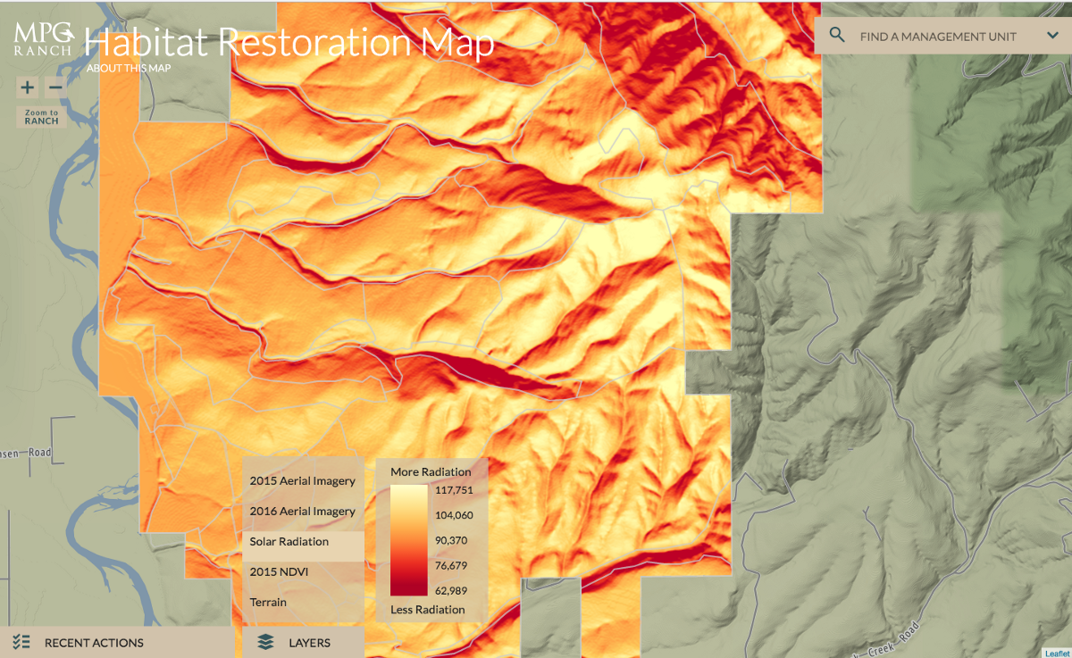
ER Right. And I’m also seeing that there’s some data around the ranch that’s not on the ranch. Those are our terrain tiles.
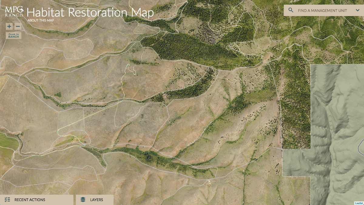
NH I feel like this is a good illustration of the value of aerial photography versus terrain tiles. The scientists were pretty excited about our ability to include terrain data in this project, because the aerial photography doesn’t fully capture elevation. You kind of get the gist of it when you look at the satellite imagery that they’ve commissioned, but then when you apply terrain you really see, “Oh, no this is definitely a draw and that’s why it has this different character to it.”
ER Oh, I see. That’s true. Right. So, yeah, if I’m just looking at the imagery, suddenly I see this upper ranch draw and I don’t know why.
NH Yes.
And then there’re a bunch of different layers. So you can look at solar radiation, and DBI and all these other kinds of things. And it all kind of works within the terrain setup. And you can also see the difference between 2015 and 2016.
They have two different aerial imagery files that you can compare, that were taken at similar times of the year, and I really like that. I really like how different the Circle Food Plot looks from year to year depending on what they were doing conservation-wise.
The next challenge that came up was to incorporate reports into the interface. They had been creating PowerPoint presentations regularly to summarize recent work, but wanted to be able to incorporate those and easily maintain a house presentation style. So we developed a slide builder that would be 100% customized to their needs, but take out some of the time and effort that went into designing by just giving them a set visual layout that they could fill in whenever they need to. And that’s working out pretty well so far. It’s fun to see real data in there.
ER It seems like it. In the last month, they’ve used it 20 times. I’m looking here at the actions for the whole ranch. They’re using it to talk about what’s happening on the ranch, not just talking about places they’ve sprayed, but also about public presentations that they’ve given. So it’s become a communications medium for the whole endeavor.
NH That was definitely a goal: to help break down some of the content silos — even if the value of that wasn’t already clear.
ER Well it’s certainly hard in general to convince people about the usefulness of these kinds of things without some kind of an artifact. They’re not going to know that they want this ahead of time, because they’re used to thinking about their own fields of interest. And it’s our job not just to give people what they say they want, but to give them what they actually need.
NH I did find it hard to imagine the complexity when the data was still hypothetical. When the environment data was just Xs and the image carousels were empty, it was easy to wonder if we’d completely missed the mark. But then once you start to see the nuance come in, different images, different data, you’ve got different elevations, different acreages. Each of these units has its own special character. And you start to be able to not just see that in numbers, but also, visually, once you start to populate the interface with images. And then things get really fun.
ER You start to be able to not just look at it as an abstract interface about a place. You start to be able to just tell different things about the land based on what you’re looking at?
NH Exactly. The way we’ve broken it down is to provide you with this aerial look, which is one piece of information. We also have the terrain data that you can see aerially. We have the multiple years of satellite imagery you can see aerially. So that was already exciting and something that they didn’t have before all in once place. But then on top of that we’re adding, “Here’s the actual photographs that if you were on the ground, you’d be able to see.” And they’re fortunate enough to have a really talented photographer on staff who is out there along with their scientists. So there’s a really great mix of images that we can get hold of for each management unit.
ER Well, that’s cool. So they’ve got a photographer that goes from area to area?
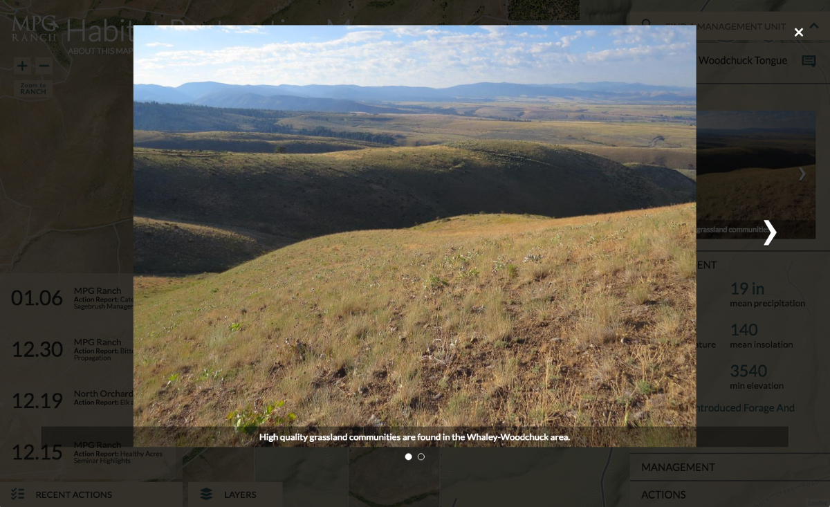
NH Yeah, he has an incredible collection of video and photography. They also have a whole bunch of live cams that capture what’s happening on the ranch. So they’re very good at documenting, not just in the typical scientific way of numbers and studies, but also in this very visual way.
ER It’s so important! They’re in a different situation than a lot of scientists. It’s not like they have to write grants for the National Science Foundation. It’s more that they need to demonstrate to ranch management all the work they’ve done and confirm the direction for future projects, right?
NH I think what we’ve done really successfully is to provide insight into recent actions and to create a rich snapshot of each management unit. What would be really fun to do would be to create even more of a comparison view where you can compare units against each other. For me, when I click on that list of management units, I just have to go at random and hope that there’s a couple of actions that I can read about when I click on it. But how cool would it be to be able to see this is how many actions happened in each one? Then you could see where there’s spikes of everyone’s doing work in the North Center Pivot, but no one’s been out to Baldy Summit in ages. I’m making this up, but that kind of thing. And again, for the layman I think this would be particularly interesting, but possibly would provide insight for ranch management and scientists as well.