
Earlier this year Zach Watson and I spent some time visualizing financial data. It’s time to make that work public. The following images represent visualization of buy/sell data during a single day of NASDAQ trades.
We mapped a small subset of the variables for each transaction:
- time of the transaction, to the second
- whether it was buy or sell
- price of the transaction
- number of shares traded
Each of these variables is represented in the diagrams below. Each image represents a minute of time, and shows every trade that happens in that minute. Each trade is shown as a circle:
- Every vertical row is a second in time. So the left hand side of the screen is the beginning of the minute, the middle of the screen is 15 seconds in, and the right hand side of the screen is the end of the minute, with 60 seconds in between.
- Blue dots are buys, yellow dots are sells
- The vertical axis is the price of the transaction; the top of the screen is cheaper stocks and the bottom is more expensive stocks.
- The size of the dot is the number of shares traded; small dots are for a few shares and larger dots are for a larger number of shares.
NASDAQ opens for pre-trading hours at 7am, and for public trading at 9:30am.
7:00–7:01 AM:
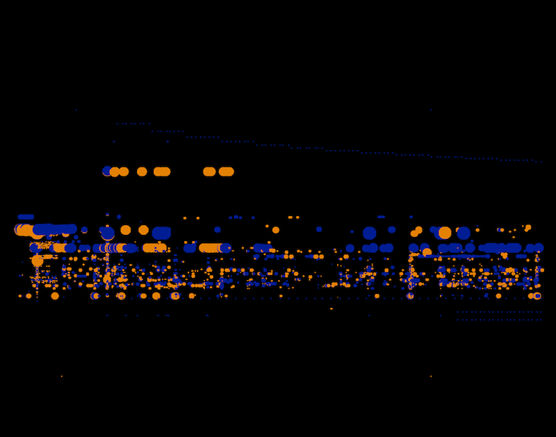
The market opens. Fairly light activity in the first minute. Most of it is contained within the middle band.
7:30–7:31 AM
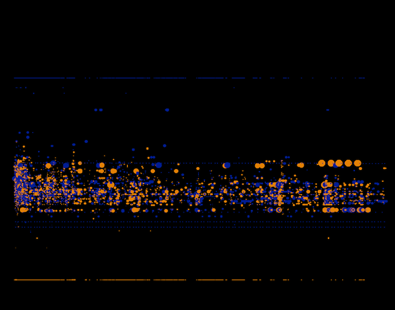
Slightly more trades are happening, and they’re for smaller amounts.
Someone seems to be buying shares at a low and high price, simultaneously — hence the lines at the top and bottom of the screen that match each other perfectly. We’re not representing who’s making these simultaneous buy/sell moves, but it would be easy to find that out or build it in.
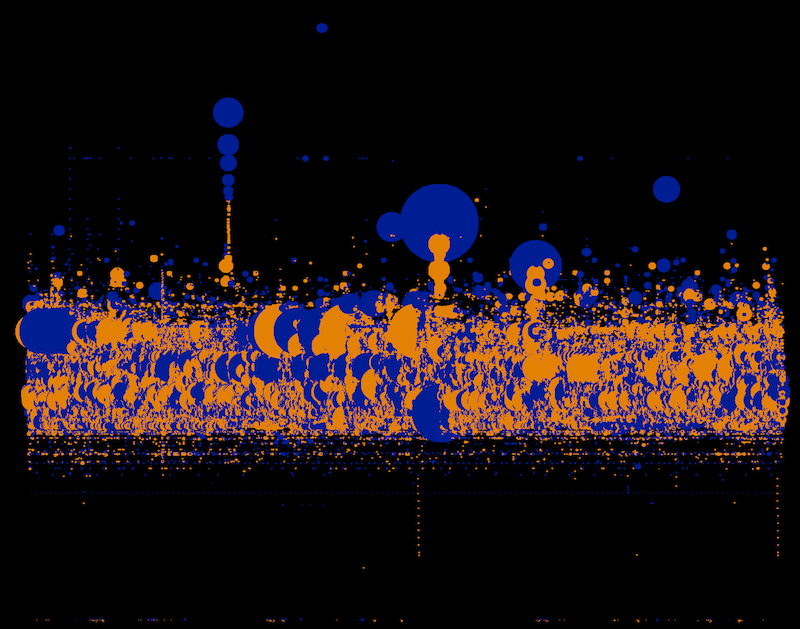
8:30–8:31 AM
This is about the pace we see for the next 2 hours, with the exception of a few bursts like this one right at 8:30am.
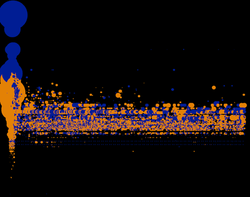
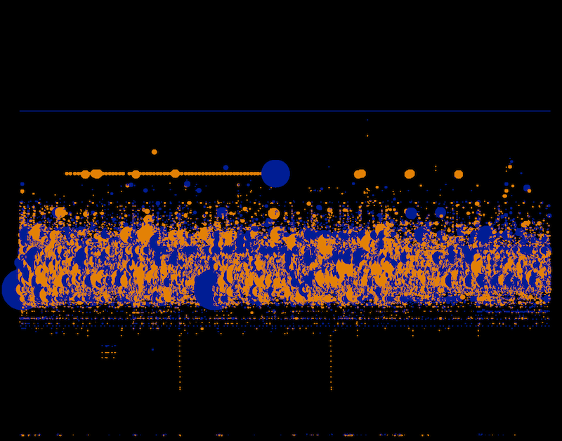
9:29–9:30 AM
There’s an incredible burst of activity just before public trading starts. It’s completely unlike anything that comes before it. Our theory is that these are algorithms getting in one last set of tiny flurrying trades before the great unwashed masses come on board.
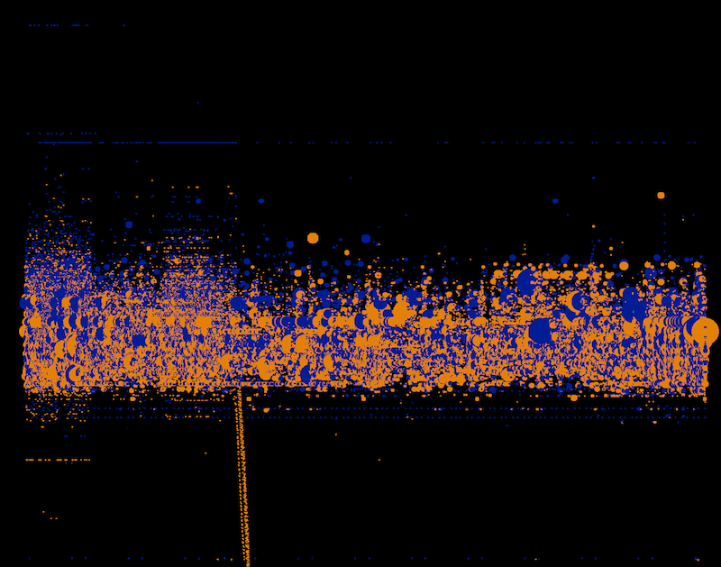
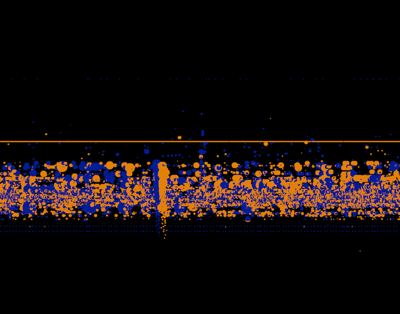
9:30–9:31 AM

Right at launch, there’s a giant burst of selling and trading, within seconds of the bell ringing.
And then the day starts:
Here’s a video of what the data looks like when it’s animated:
Untitled from Stamen on Vimeo.
There are literally thousands more where these came from. It’s surprising us how much loveliness is in this financial data, which is generally perceived dry and boring, only interesting to bean counters.
What I like most about what’s come out of this exercise is this idea that you can visually start to detect a difference between normal and anomalous data, even for what’s normally considered data that lay people can’t understand. If we could find a way to make it easier to understand what’s happening in the markets, there’s potential here for a kind of literacy in financial data that could help to offset some of the damage done by unscrupulous experts over the past few years.