
What makes one place feel different from another? The language, the food, the landscape, but also a hundred subtler things: the colors that houses are painted, the speed people walk, the siren sounds and… the way that data flows to cloud servers?
When Google approached Stamen to develop an engaging visualization of Cloud Storage traffic, we weren’t sure what we’d find. At the beginning, we were looking at simple data, but a lot of it: traffic between Google Cloud regions and countries, aggregated on a very coarse scale.
Early prototypes
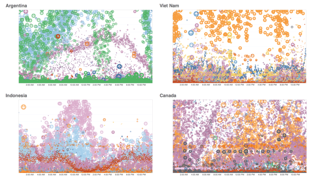
A surface level analysis showed only surface level patterns — heavy usage dthe Global North skewed towards the waking hours of each country. But when we dove in further, a new type of subtle distinction in place was revealed. Our initial explorations, done quickly using Tableau in order to discover what stories are waiting in the data, revealed a wealth of texture, difference and similarity. These regional variations in Cloud Storage traffic are multivariate and sometimes surprising.
Time is a flat circle
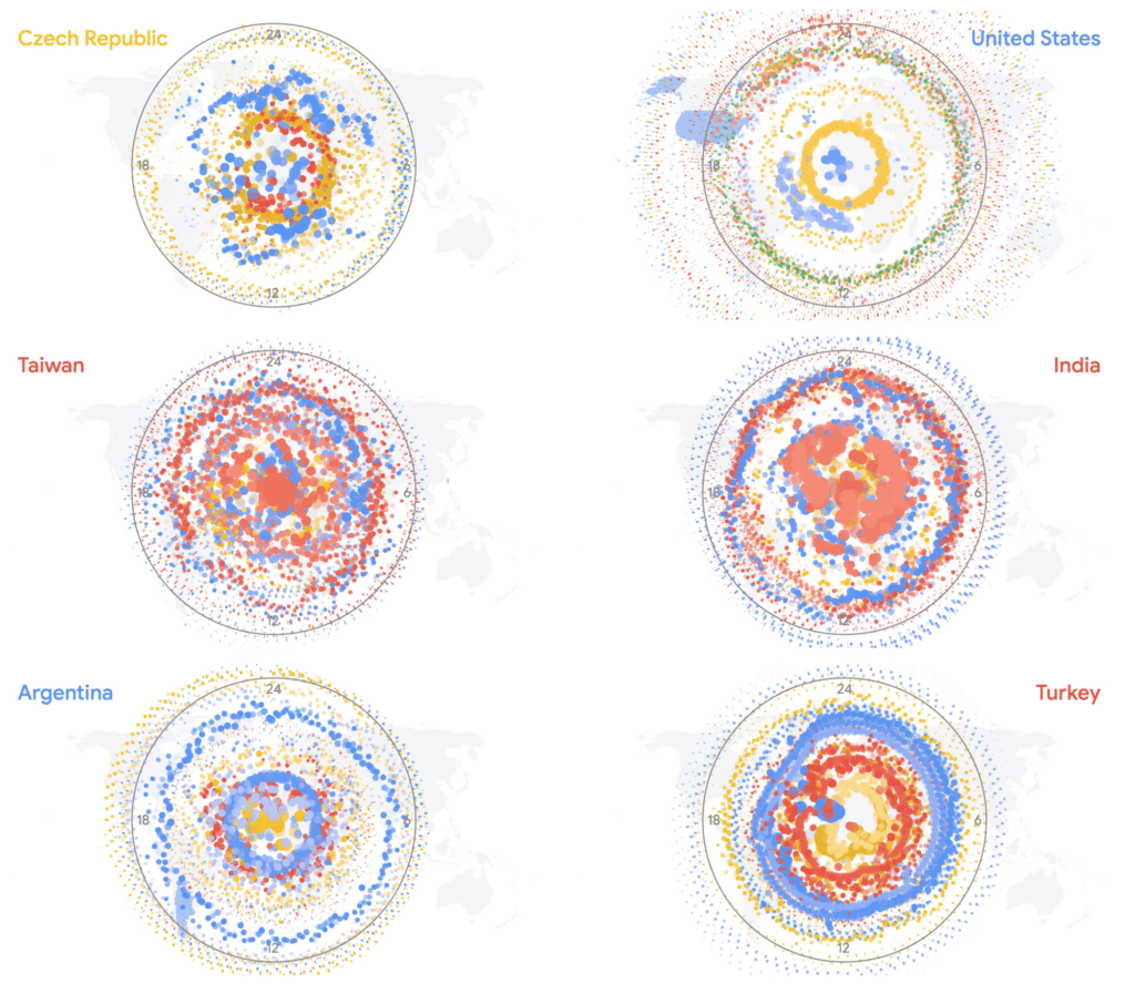
There was clearly something there in these initial explorations. This data was more than a bunch of time-series, it was fascinating! To dive in deeper, we went back to the drawing board and tried a variety of alternative visualization techniques, including showing request volume over the course of a week as a series of 24-hour clocks.
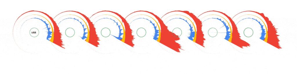
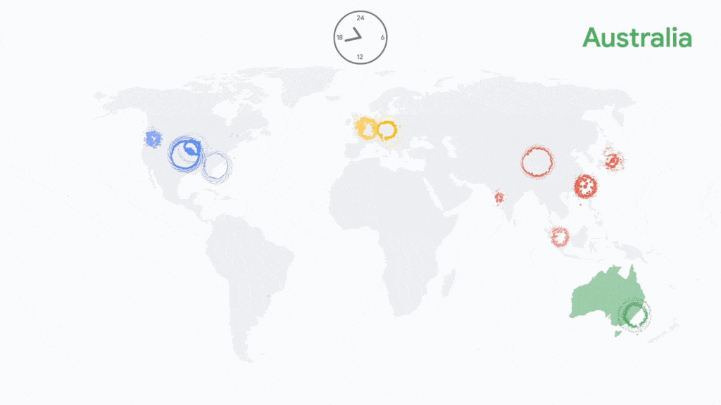
Each color shows data movement to a different Google Cloud region, with egress flaring outwards like a coronal mass ejection and ingress punching through towards the center of the ring, during especially dramatic periods of use emerging out the other side.
We liked the circular motif and the way it naturally represented a day cycle, but the motion proved too difficult to compare to other countries. A radial stacked area chart, on the other hand, simplified the data into a single, static form while still managing to reflect the individual nature of each country and it’s relationship with Google Cloud. These glyphs also proved useful for comparing the patterns of request volume and destination across the globe. When displayed geographically, you can see continents of Cloud traffic stand out, divided by geographic, cultural, and economic lines.

Connections and collaboration
Could we find those expected and unexpected connections between different sides of the world more quantitatively? By measuring the cross-correlation of a time series, we can tell how related two timeseries are. If traffic in Colombia spikes, is traffic in Ecuador likely to as well? In Algeria?
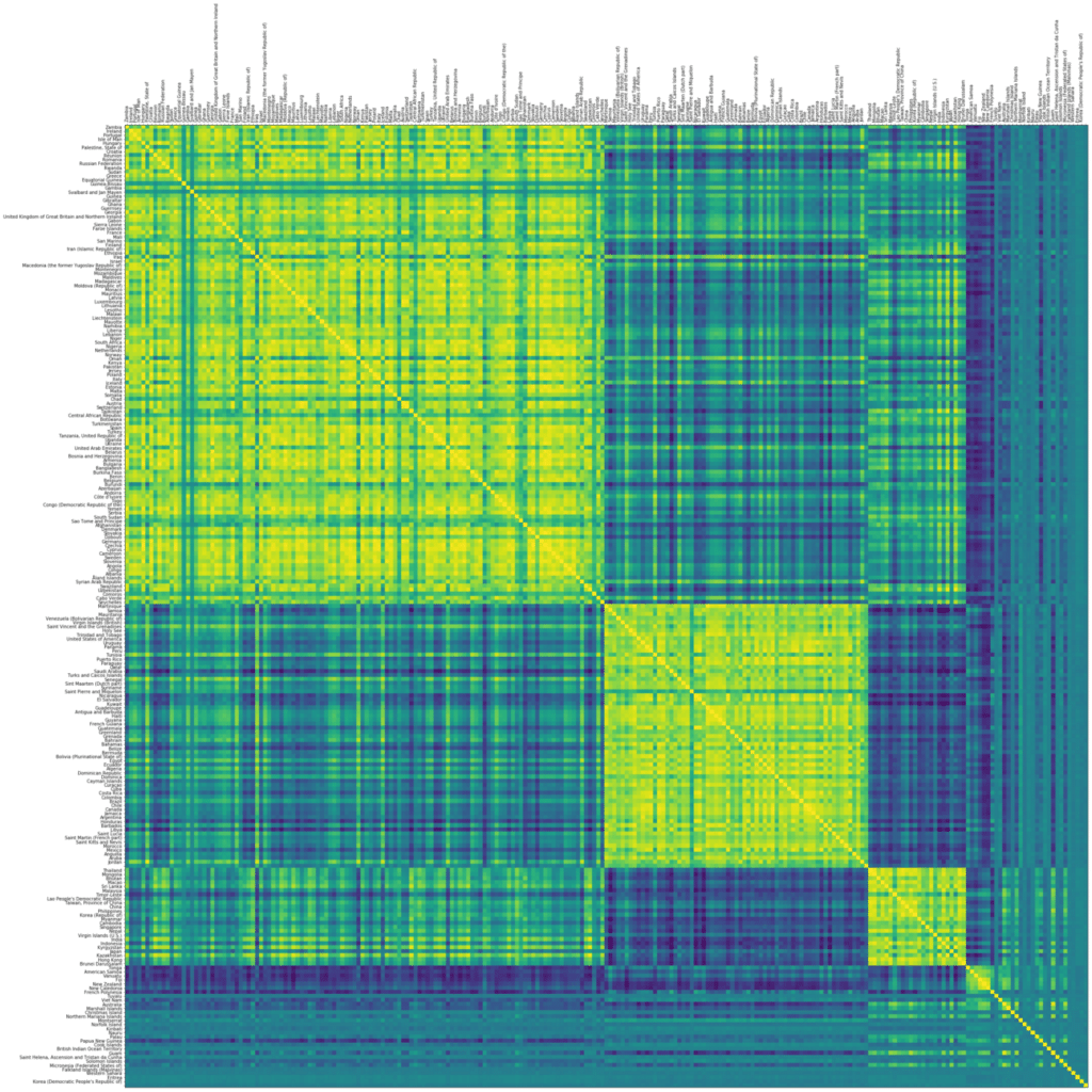
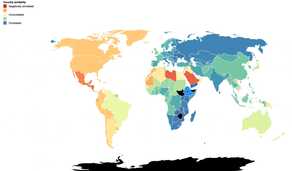
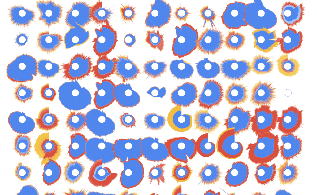
A cross-correlation matrix shows this association between every pair of countries, based on Google’s Cloud traffic data. We can see a surprisingly rich structure in this diagram — continents of economic affinity, cultural cooperation, and technological collaboration across the globe.
Scale and scope
The work to this point revealed that there were different stories that could be told. Showing the characteristic pattern of each country, revealed individuality in the data. Showing connections and correlations between countries revealed collaboration. But how to show the scope of Google Cloud Services — that they have active users in every country, that traffic is flowing around the globe 24/7?
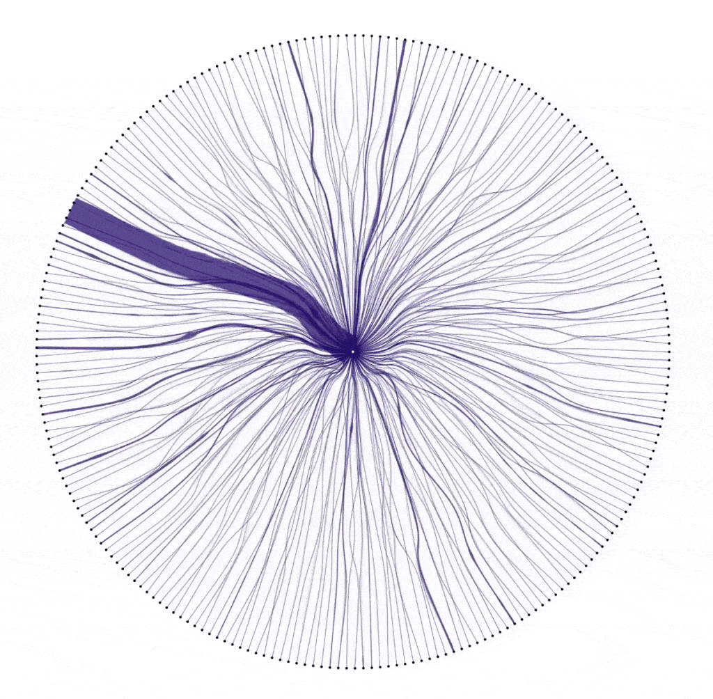
We laid out every country in the dataset, and drew connections between them and Google Cloud regions. Surges in data could be seen as pulses traveling down organic, shifting, river-like connections between distant computers.
But it was missing the textural depth and complexity that had attracted us to this project in the first place. A different approach was necessary. Big screen, big conference… maybe a big video?
The final piece
We decided to produce a video visualization that gave every country the spotlight. We could jump from country to correlated country, showing unexpected collaborations and prompting conversation and discussion. Multiple hours long, the video would give a different informational and explanatory insight to each passerby at the conference.
As each country is featured, the viewer can still find the textural complexity that surprised us at the beginning of the project.
Method and technologies
Every project that Stamen works on is a little different, and every project provides an opportunity to learn new tools. This project was mainly developed using vanilla Javascript and HTML5 Canvas, hardly new tools by any means. However many of the transitions and visualizations pushed the ability of Canvas to render in real-time, with tens of thousands of arc segments, not to mention points, complex polygons, and text being drawn on the same frame. To compound this, our deployment target was a Chromebox, which definitely would not have been able to render at 30 frames per second.
What to do? We used CCapture.js, a clever library that monkey-patches Javascript’s Date function to effectively slow down time. Using some WebWorker magic, it saves each Canvas frame as an image and writes them to disk, letting us render an animation slower than real-time.
See for yourself!
This data visualization has been installed at Google Cloud Next in San Francisco and Tokyo so far, but it’s not too late to see it in person! The next stop on this world tour is at Google Cloud Next London, from October 10–11.