This post was originally published on stamen.com by Zach Watson.
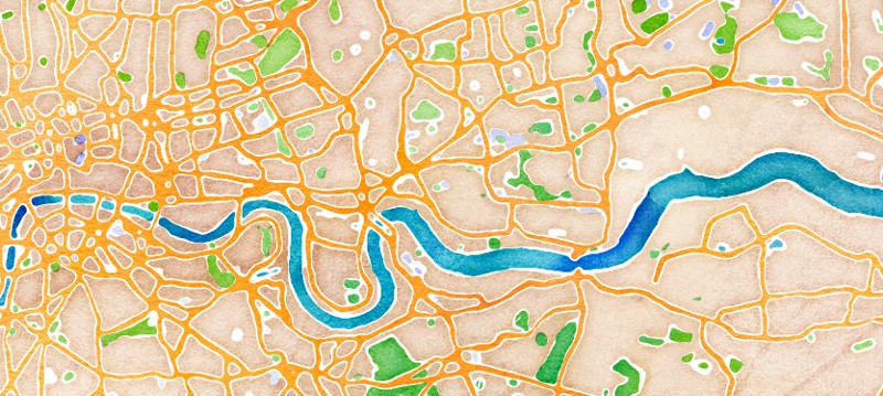
Yesterday, we announced a trio of new maps on maps.stamen.com — we’ve had a lot of interest in how the watercolor map gets generated, so here’s the play-by-play. We’ll be using a section of London as an example:

To begin with, we wanted to capture some of the irregularities of a truly handmade object. Although we’re working with OpenStreetMap vector data, we decided to do all of our styling in raster space — the main reason was to have access to the overlaps of objects, but there are a couple of really great side benefits: the process doesn’t increase in time for denser areas (i.e. cities, which is mostly what people look at), and it’s entirely deterministic (important when you’re stitching together tiles). We also wanted to be able to treat ground, water, green space, and so on differently, so we’re actually running this process multiple times for each tile.
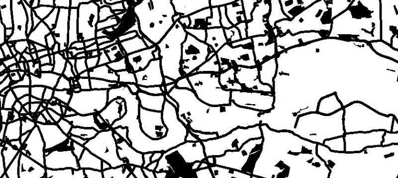
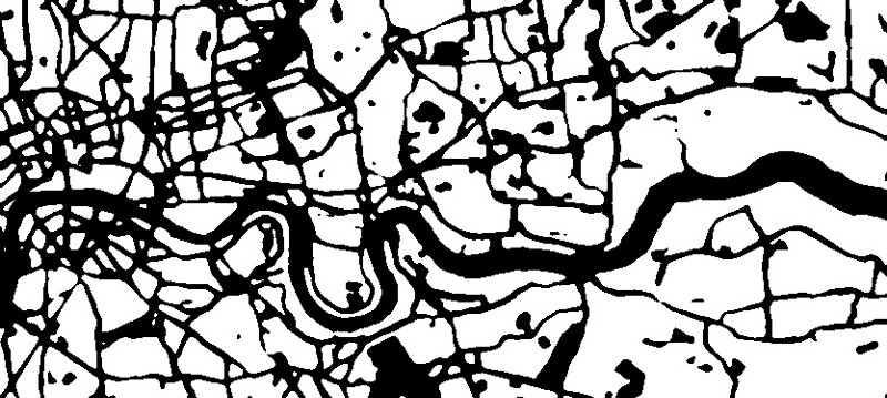
First, we render out some extraordinarily vibrant Mapnik images:
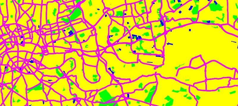
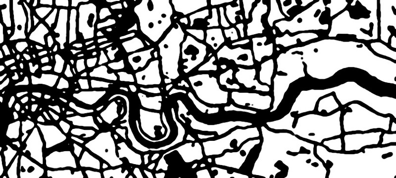
These can then be split up by grabbing all the yellow (for instance) and using that as a mask:
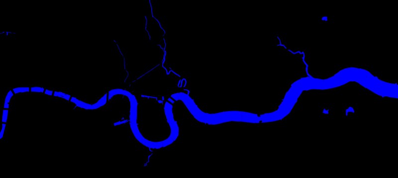
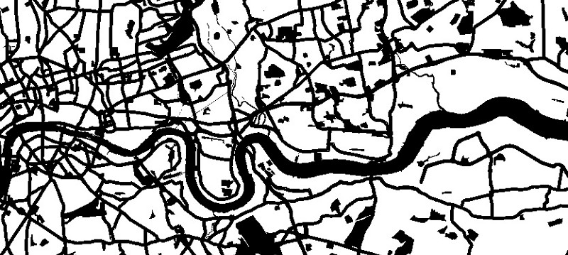
Because of how OSM treats water, we’re actually subtracting the blue area from the mask as well:
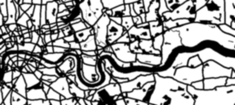
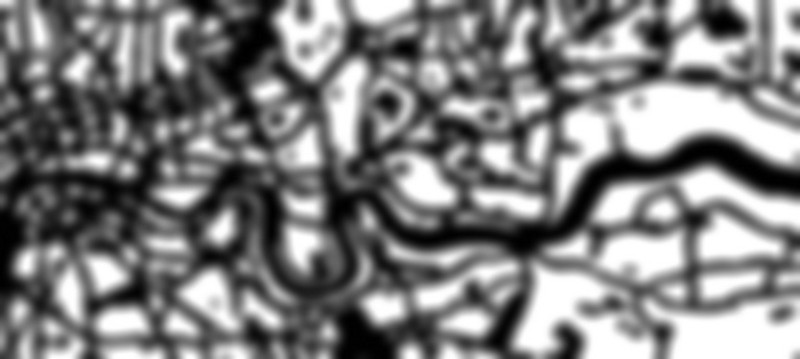
Next, we do a gaussian blur:
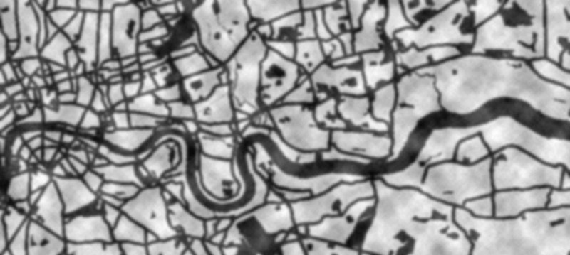
And add a Perlin noise image. This is just a 1024×1024 image that we tile:
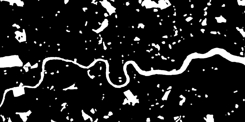
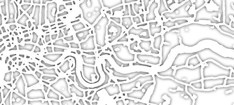
Now we do a threshold to get a new, fuzzier, wobblier outline:
And do some antialiasing to get our final mask:
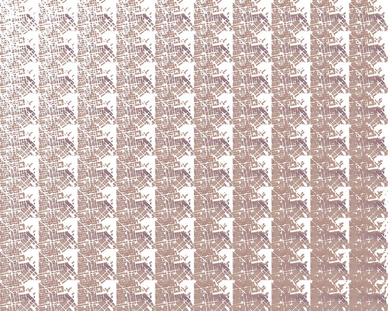
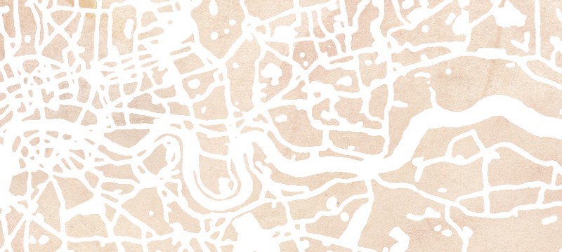
Which gets applied to a tileable watercolor image:
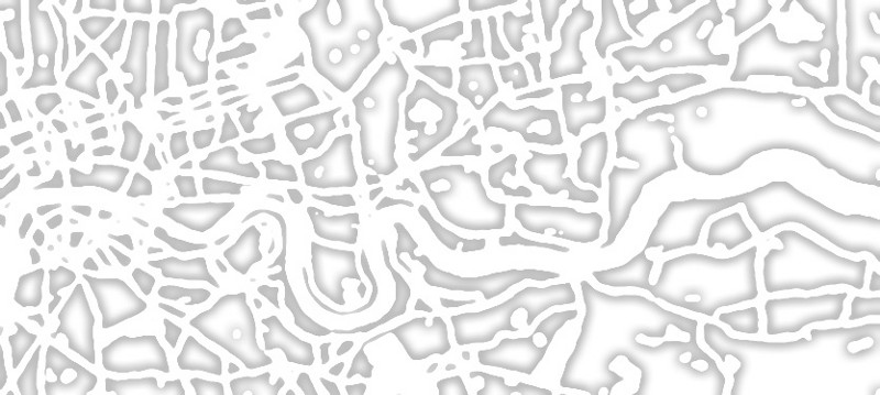
The other fancy bit of code adds a slight dark outline to the painted areas, to mimic the watercolor drying at different rates, and depositing more pigment at the edges. To get this sort of edge darkening, we do a gaussian blur of the mask:
And only then use the original mask to get just the interesting bits:
But that ends up giving undue weight to small or narrow areas. So we invert that and use it as an alpha channel on the gaussian blur, which evens things out:
This is then added as an overlay onto the masked image from before:
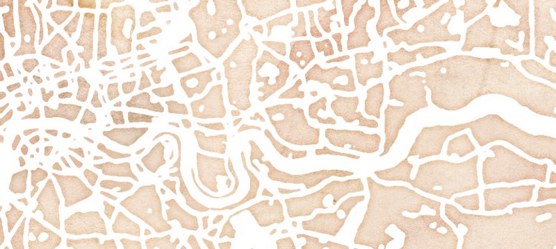
And we have one layer! This process is repeated for the other layers (in this case, water, green spaces, civic spaces, and highways) and composited into the final image:
Tomorrow, Geraldine’ll be posting about the textures that went into the map.
EXTRA BONUS CONTENT:
As you can imagine, there are a lot of variables that go into this algorithm — so, to help ourselves visualize what tweaking each of those did, we created any number of samples. As a peek behind the curtain, here are a couple of examples: